Epolis — insurance company
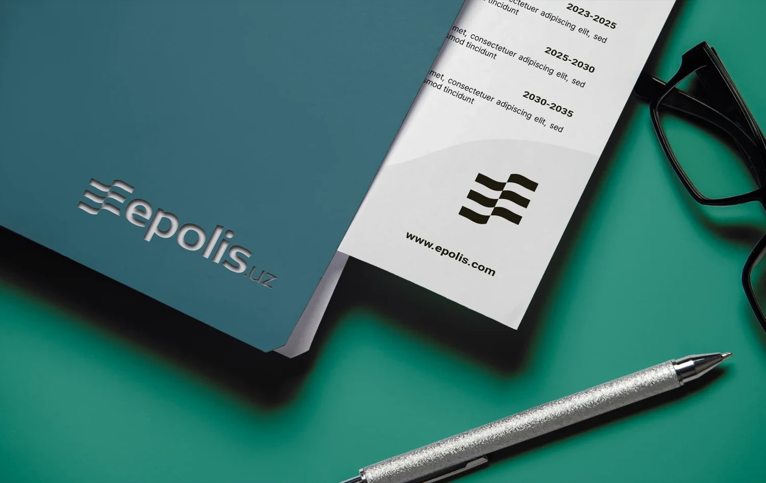
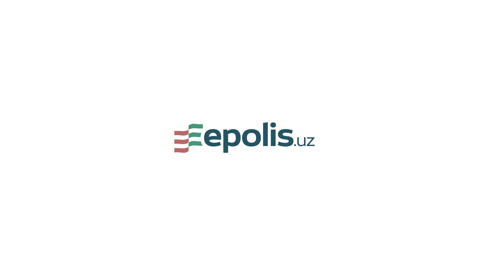
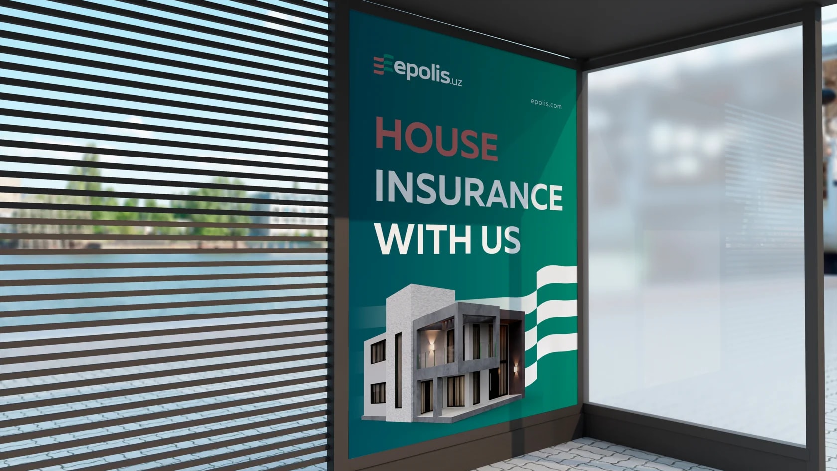
Epolis Plus is an insurance company whose visual identity is built around protection, support and confidence. The logo combines several ideas that reflect the brand’s character and mission.
Task:
Create a simple and memorable logo that clearly communicates the company’s field and represents support during unexpected or difficult situations.
Solution:
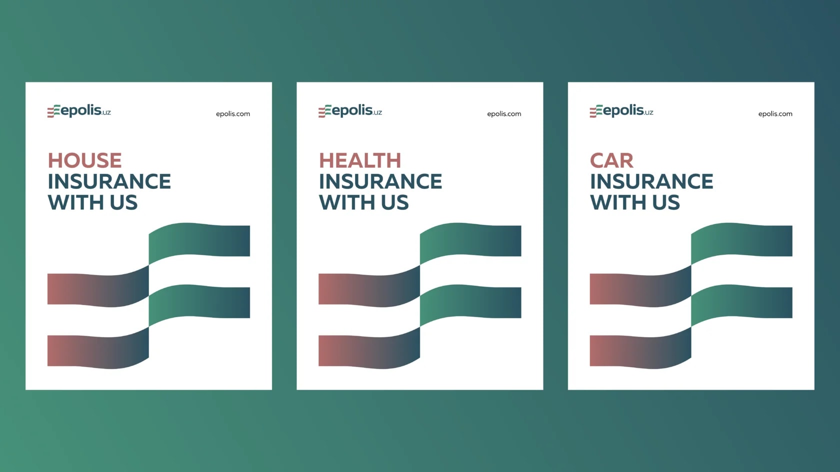
The symbol is built around the letter E, shown in two colors and shaped to resemble a flag — a sign of shared values and purpose. The contrasting stripes can also represent different moments in life: green and red, white and black, reflecting positive and difficult periods. Through this concept, the logo communicates Epolis as a brand that supports clients in uncertain situations and helps restore a sense of stability.
Next projects
Drongo — bicycle and electric scooter retail
Drongo is a private label company specializing in the sale of bicycles and electric scooters. Its visual identity is built around movement, safety and modern minimalism.
Vitor — dietary supplements brand
Vitor is a company specializing in the production and sale of dietary supplements. Its visual identity is built around naturalness, lightness and energy.