Profi University — a university trusted by the people
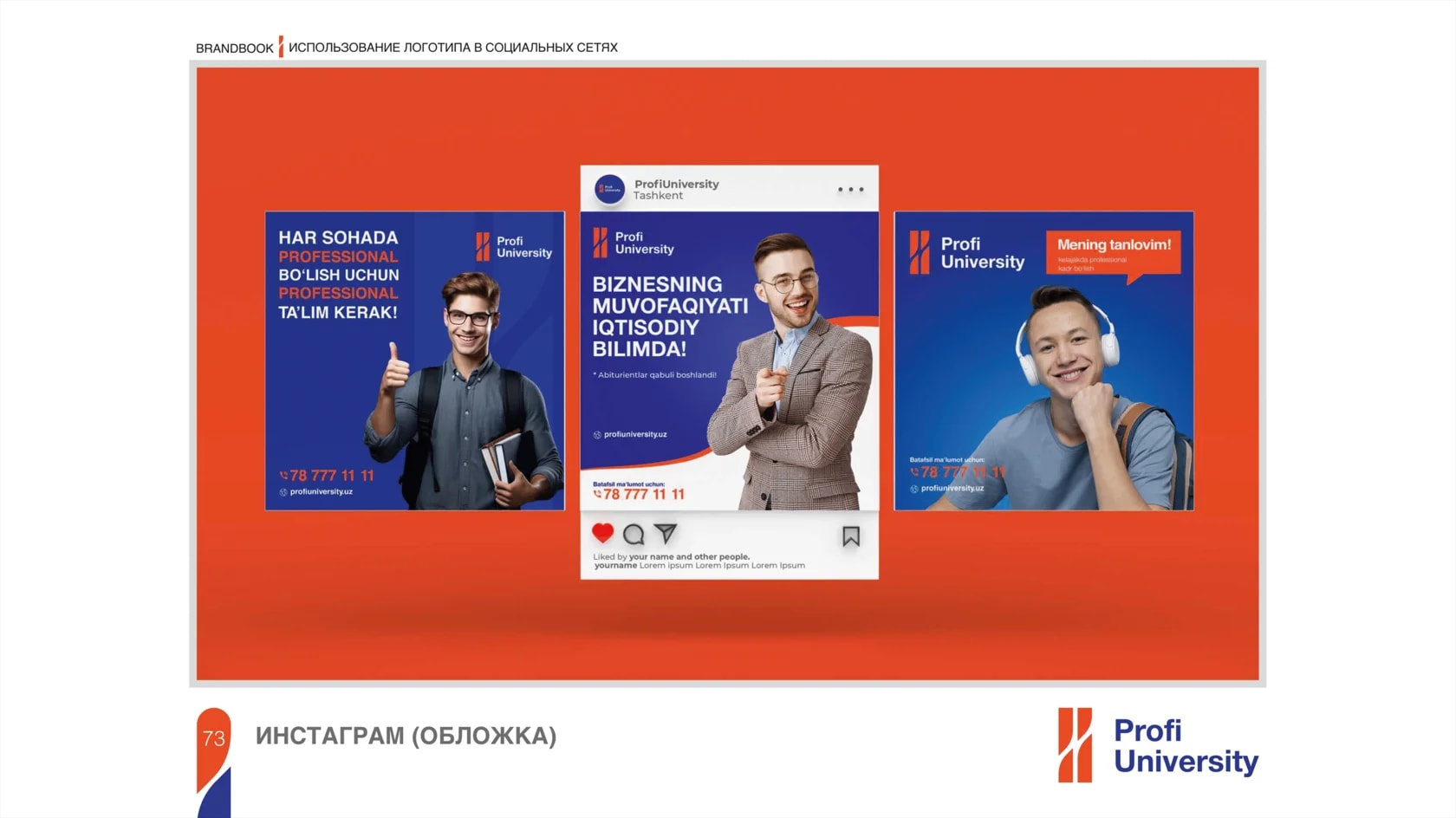
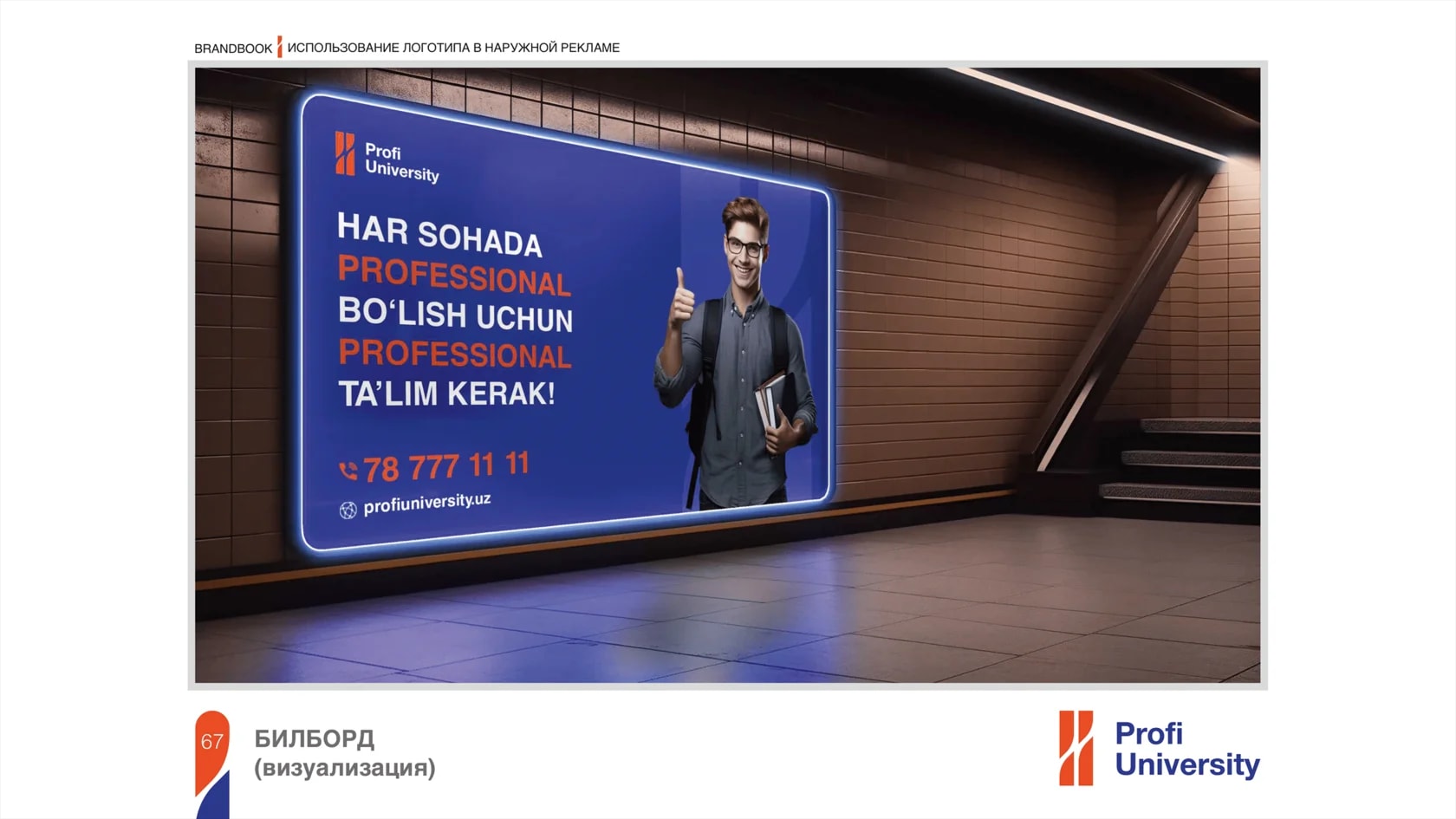
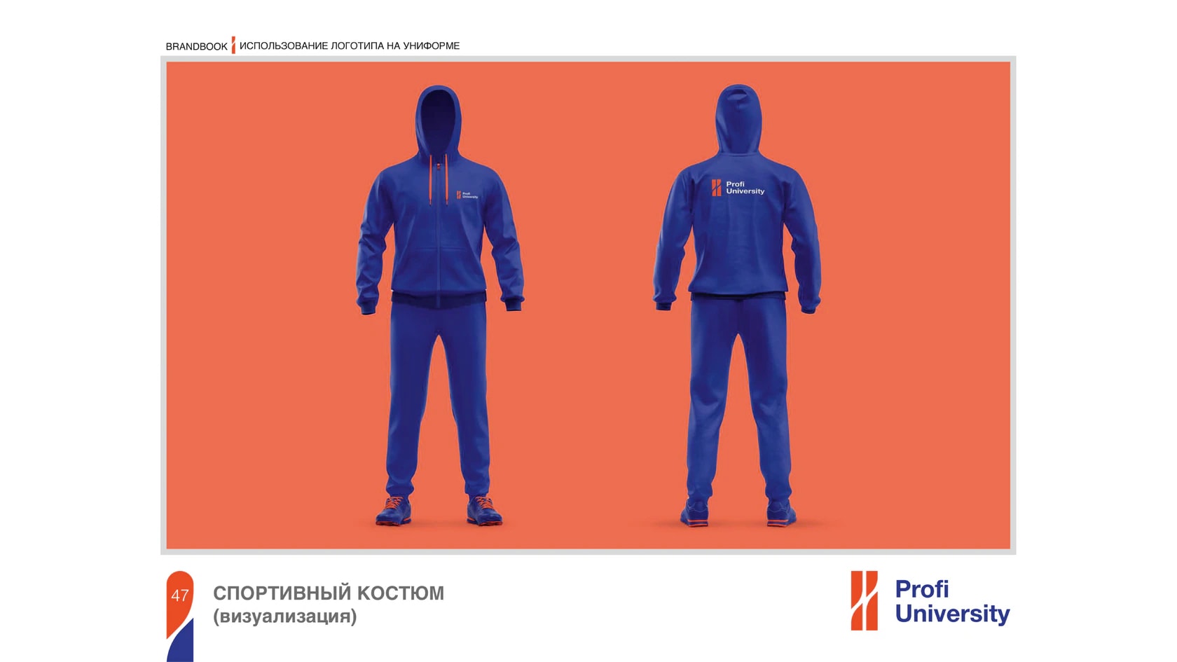
Profi University is a university that has earned public trust and continues to grow together with its students. Its new visual identity is built around the ideas of growth, support and the right direction.
Task:
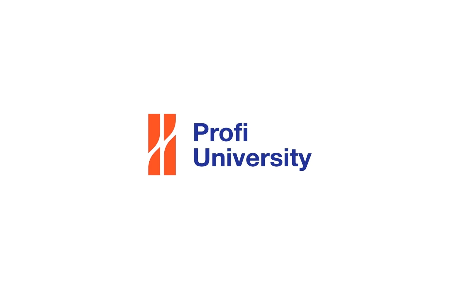
Create a modern and practical logo that reflects the university’s values, communicates personal growth through education and strengthens the brand’s recognition.
Solution:
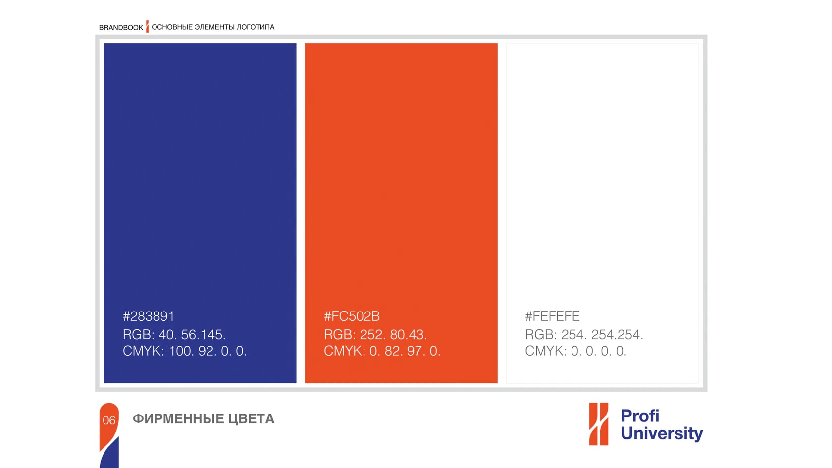
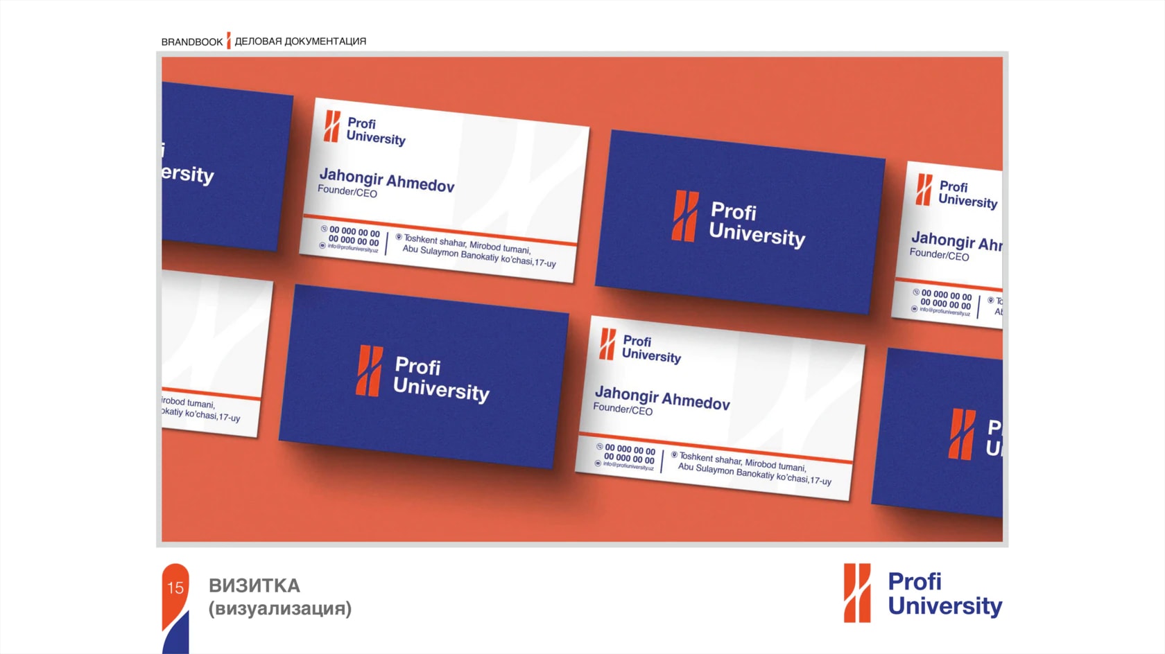
We developed a symbol that combines several meanings. The letters P and U are hidden within the form, while the composition resembles two people, with one helping the other move upward. The internal lines also represent a path and growth, reinforcing the idea that education not only provides knowledge but also helps guide people in the right direction.
Next projects
Amelie's — a place for French desserts
Amelie's is a café of French ice cream and pastries inspired by the atmosphere of the film Amélie. The brand identity is built around lightness, warmth and the romance of everyday life.
Magic Toys — toys for children
Magic Toys is a toy brand built around joy, imagination and childhood creativity. Its visual world communicates playfulness and a sense of magic.