Takeshi — the harmony of sausages and coffee
Takeshi is a network of mobile sausage kiosks combining quick snacks and coffee in one concept. The brand identity is built around simplicity, originality and memorability.
Task:
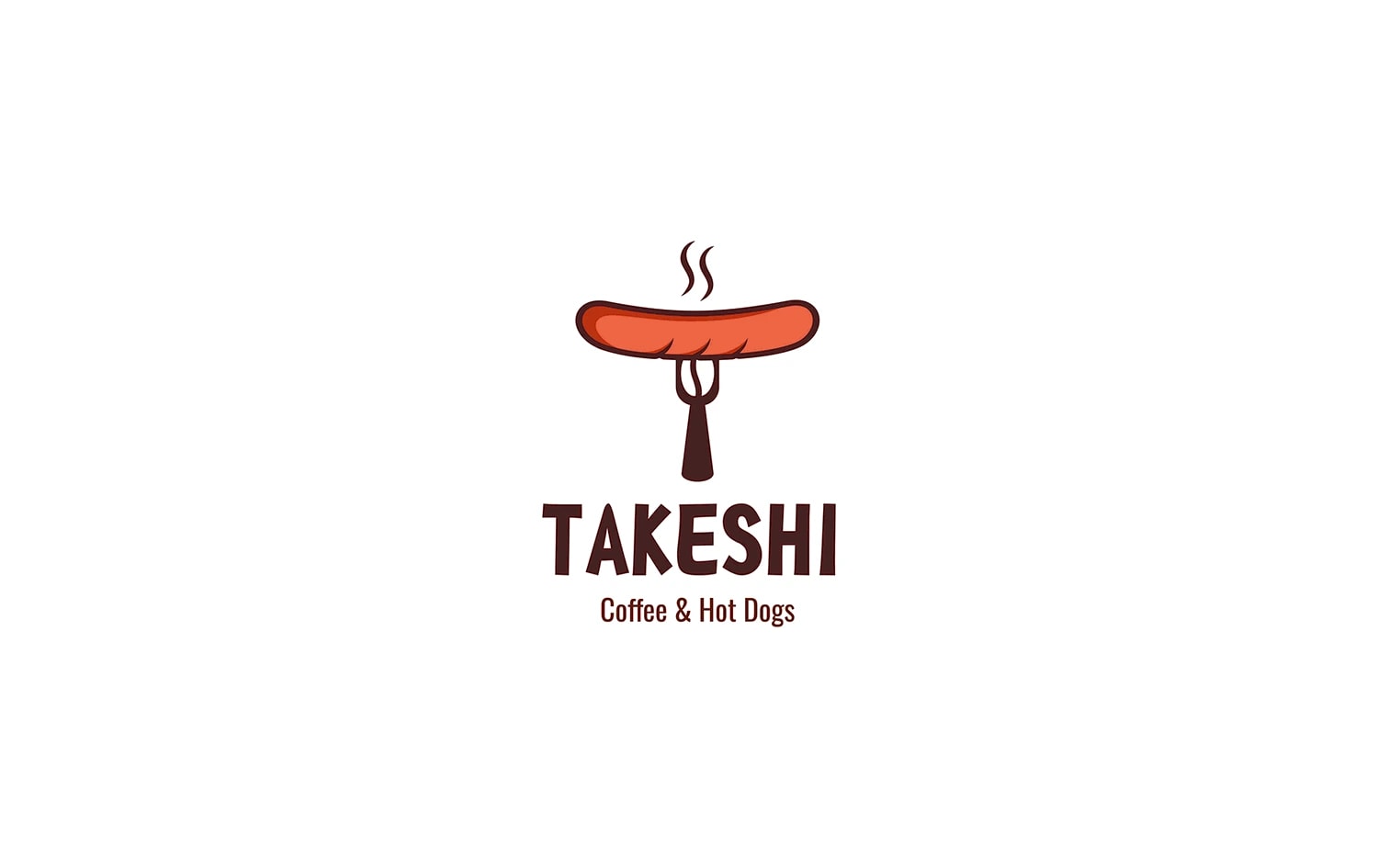
Create a logo for the Takeshi mobile kiosk chain that reflects the brand’s concept and helps it stand out from competitors. The key goal was to combine the main product associations into one recognizable mark.
Solution:
We designed an original logo that combines a sausage on a skewer, coffee and the letter T. This approach clearly communicates the brand format and makes the sign distinctive and easy to remember. As a result, the brand received a logo that helps attract new customers and stay in the minds of existing ones.
Next projects
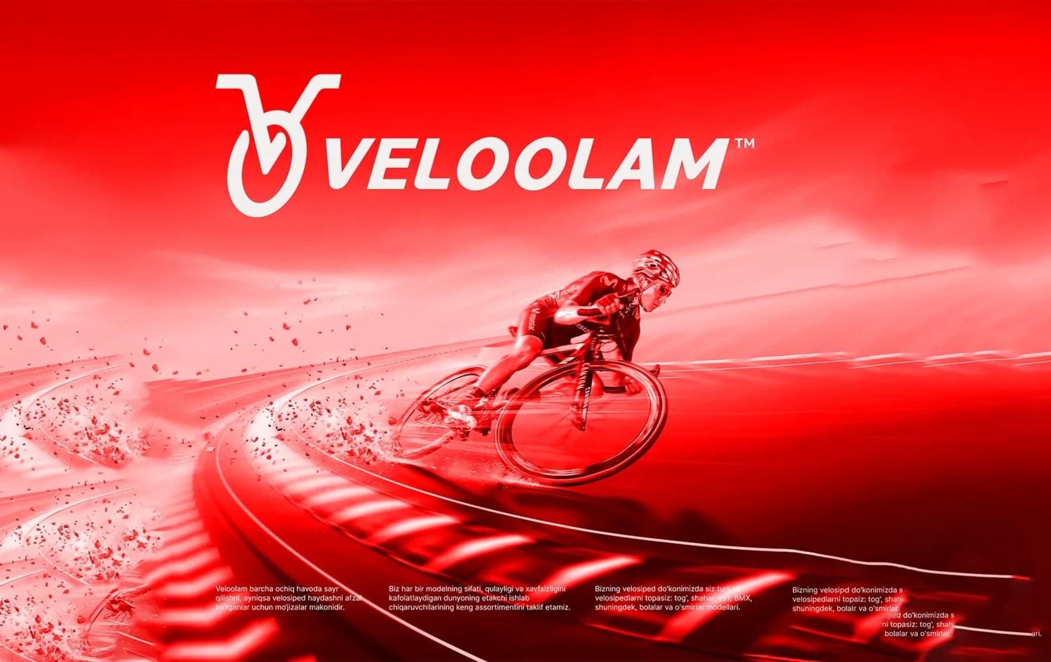
VeloOlam — bicycle rental company
VeloOlam is a bicycle rental service with a visual identity built around movement, speed and mobility. The logo reflects the brand’s dynamic character and directly connects with cycling.

7Fitness — sports equipment distribution
7Fitness is a company specializing in the distribution of sports equipment. Its visual identity is built around movement, energy and a professional approach.