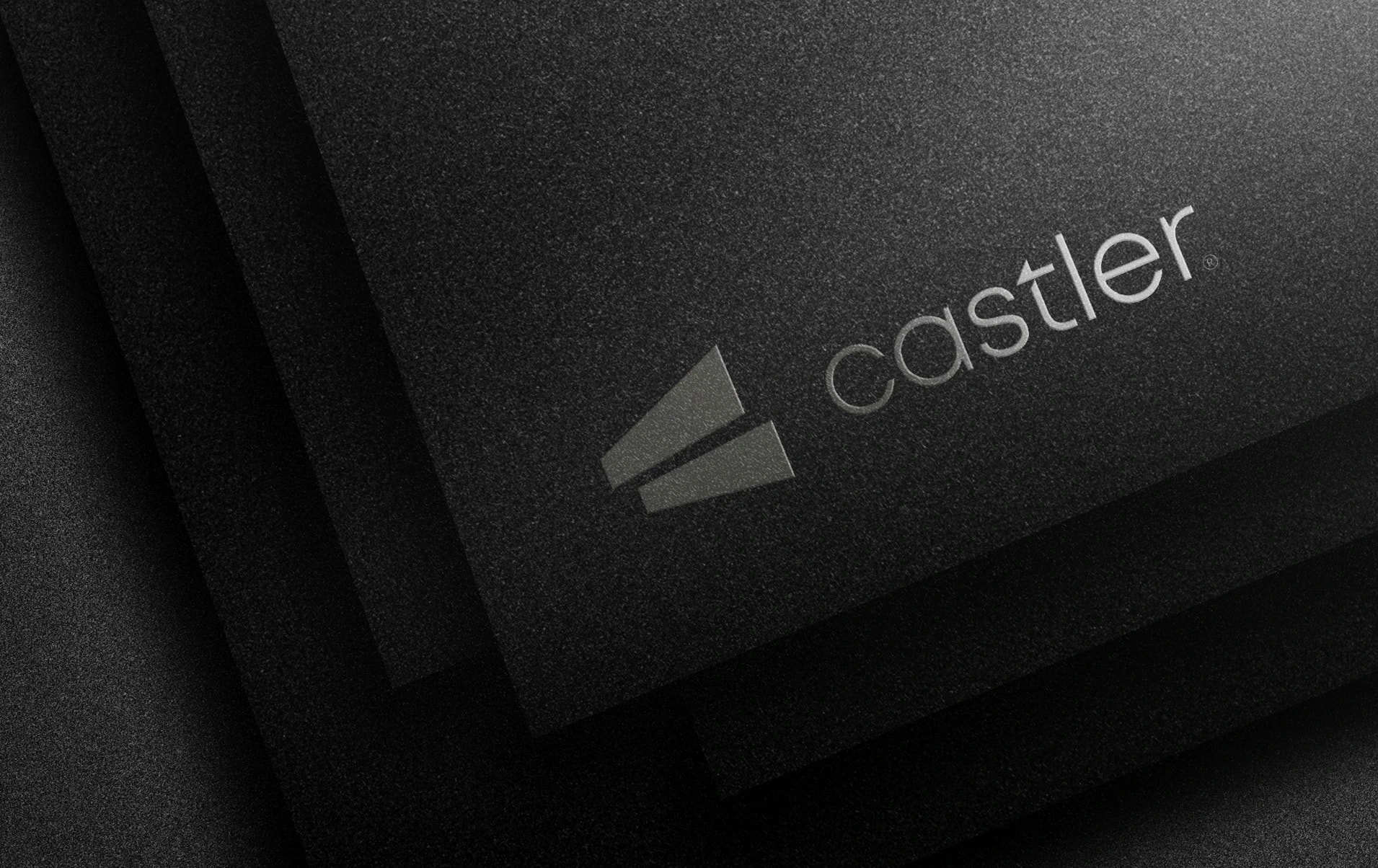
Castler — logo for an architecture studio
An architecture studio came to us for a turnkey brand: from the name to the logo and visual identity. Both the name and the mark had to grow out of the company's values, not out of a random pretty picture.
Task:
Find a name and create a modern logo based on the company's values. "Castle" means a palace or fortress, and the suffix "-er" marks a profession. That is how Castler was born — "the one who builds castles". The name sounds bold and luxurious, and it reflects the goals the studio sets for itself. Complex, cluttered logos can't hold a client's attention for long. So we chose minimalism: remove everything extra and keep only what matters.
Solution:
The mark combines the letter C with structures in perspective that point to architecture — floors and facades receding into the distance. The same lines became the brand pattern. The palette is olive gold, graphite and a cool grey-blue: quiet luxury rather than loud shine. We tested the identity on business cards, letterheads, a drawing tube, merch and a construction hoarding with the slogan "Designing for the future, building for today". Castler got not just a logo, but a complete image of a studio you can trust to build castles.


Next projects
Kidi Mart — retail chain for children and mothers
Kidi Mart is a specialized retail chain for mothers and children. The brand combines care, comfort and a bright atmosphere that appeals to both children and parents.
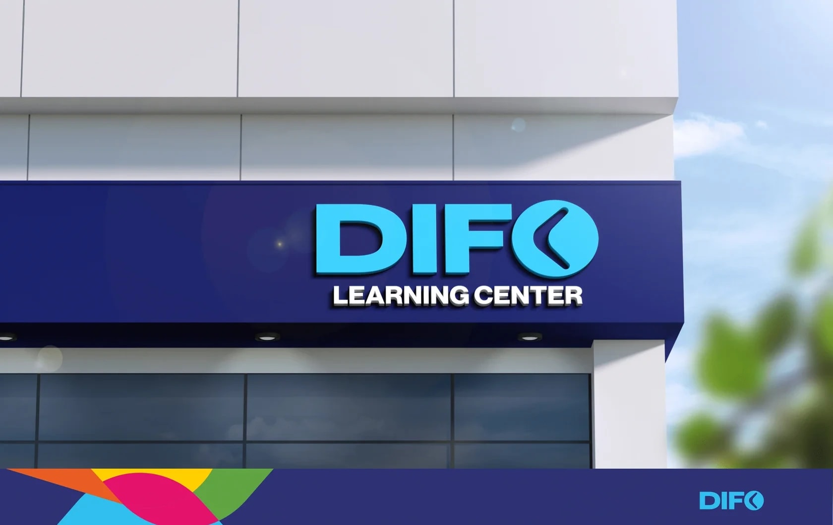
Difo — educational center
Difo is an educational center whose identity is built around the meaning of its name and slogan. The concept is based on the idea of knowledge that stays with a person and leads them toward success.