Manaku Mebel — symbol of durability
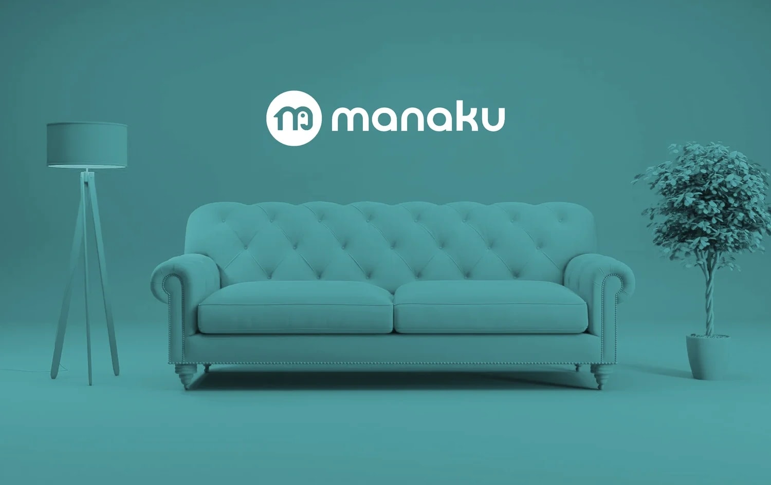
Manaku Mebel is a furniture brand known for its strength and reliability. The new visual identity was built around the ideas of stability, trust and ease of use.
Task:
Create a minimalist and practical logo that clearly presents the Manaku name and includes both a symbol and a typographic part. It was important to reflect the brand’s key advantage — the durability of its furniture.
Solution:
We chose the elephant as the core symbol of the logo because it represents strength, stability and trust. Combined with clean typography, this approach resulted in a memorable and functional identity that highlights the brand’s reliable character.


Next projects
Amirkand — dried fruit trading
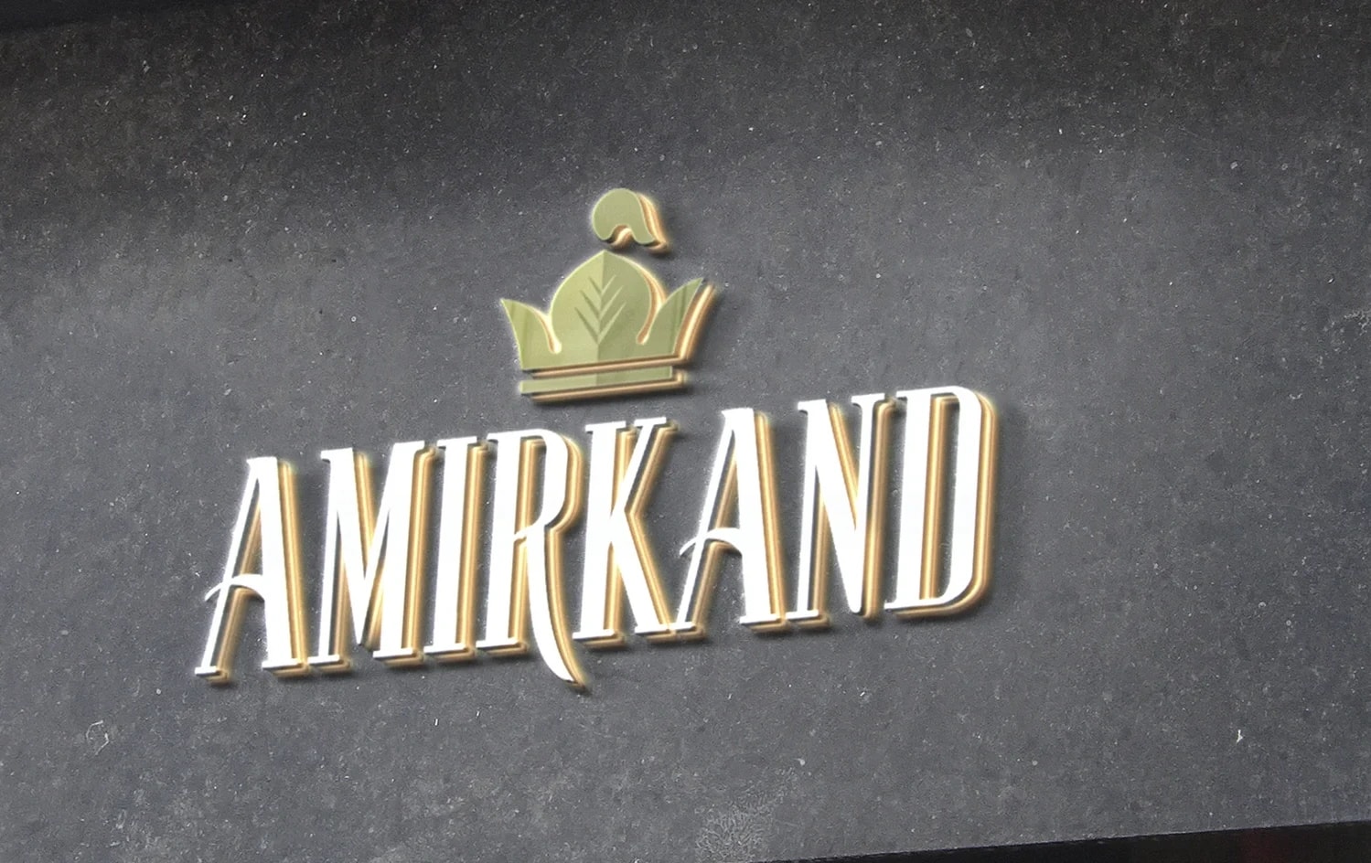
Amirkand is a brand operating in the dried fruit market. The project was built around the historical and cultural associations already embedded in the brand name itself.
Aktuz — portable device for allergy support
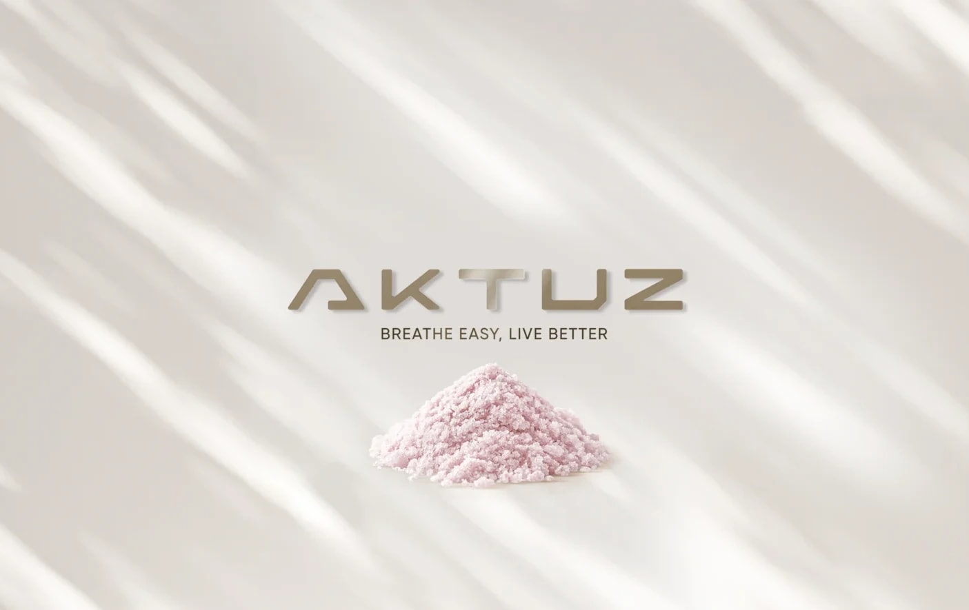
Aktuz is a portable device designed for people dealing with allergies, asthma and respiratory conditions. Its brand identity is built around easier breathing, technology and a better quality of life.