Amirkand — dried fruit trading
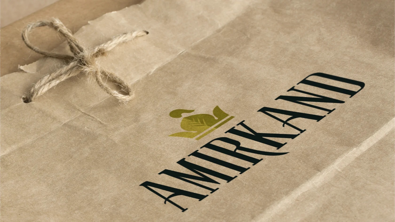
Amirkand is a brand operating in the dried fruit market. The project was built around the historical and cultural associations already embedded in the brand name itself.
Task:
Develop a logo for a dried fruit company based on the existing name Amirkand. The goal was to create a distinctive and memorable visual identity that reflects the brand’s historical and cultural character.
Solution:
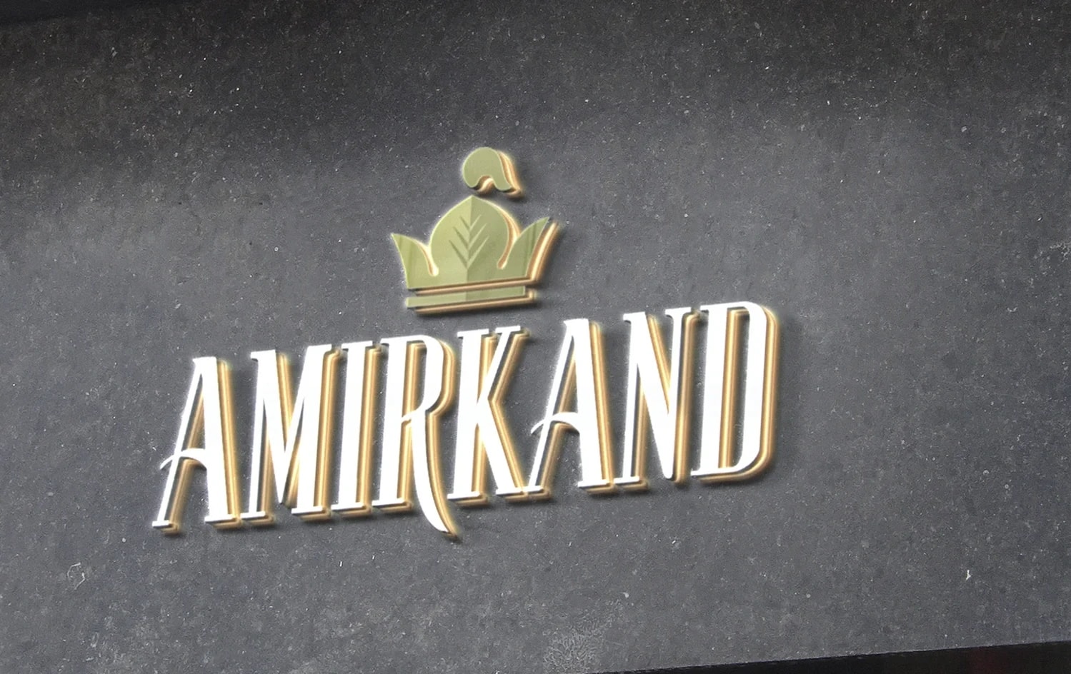
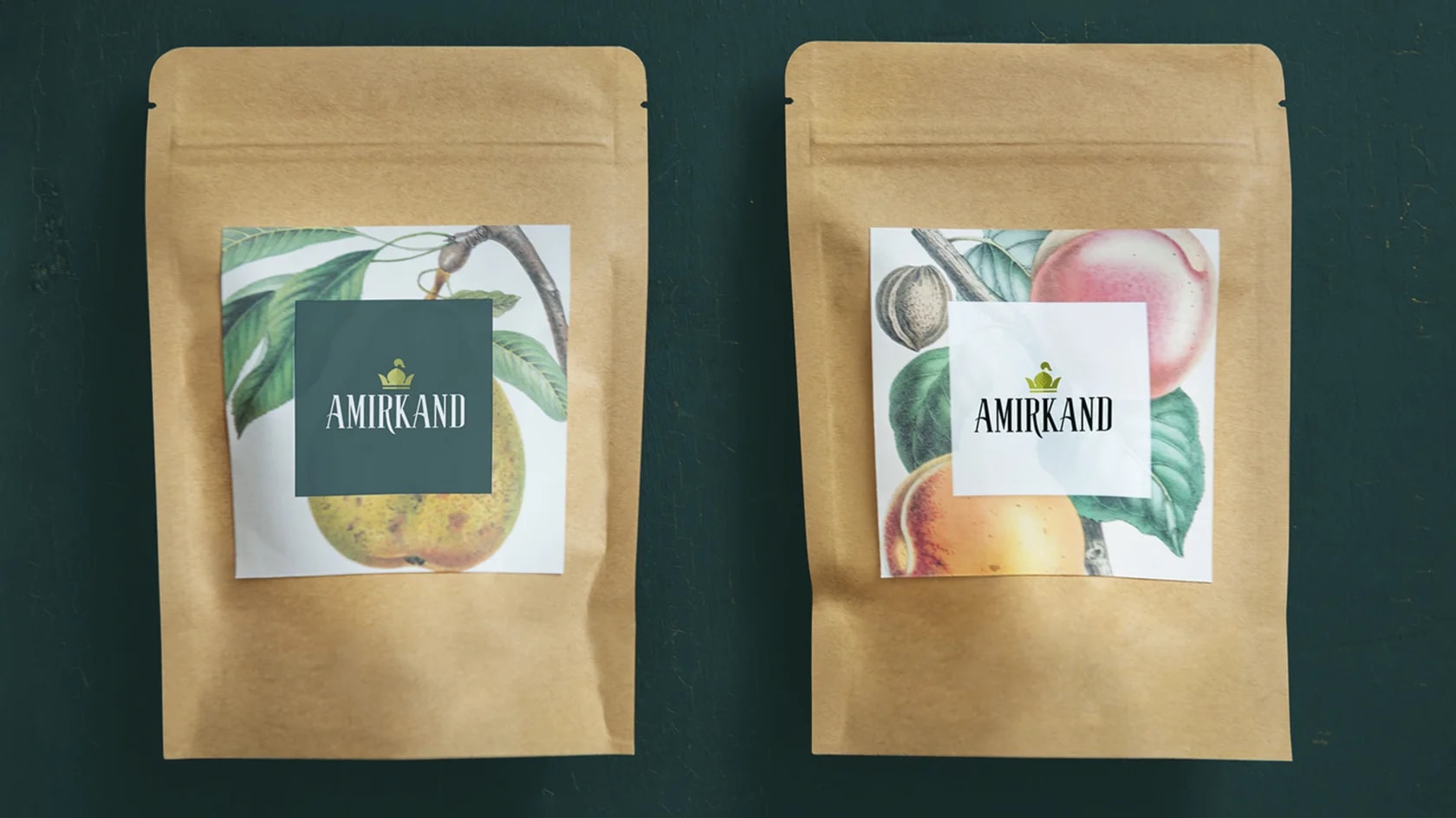
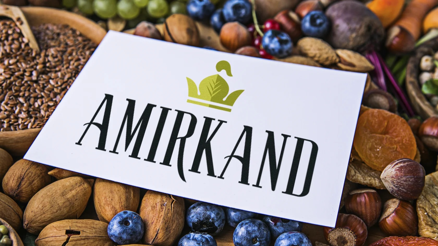
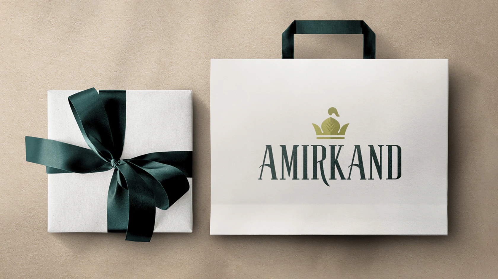
We used a crown as the central symbol, drawing inspiration from the status and grandeur of Amir Temur, and enriched it with a decorative feather. As the main color, we chose a pistachio tone, often associated with wealth and value in many countries. The design was further supported with ornamental patterns, helping shape a rich and unique brand image.

Next projects
Aktuz — portable device for allergy support
Aktuz is a portable device designed for people dealing with allergies, asthma and respiratory conditions. Its brand identity is built around easier breathing, technology and a better quality of life.
Tashkent Slasti — food distribution
Tashkent Slasti is a food distribution company. Its visual identity is built on the combination of Tashkent’s historical heritage and a contemporary graphic language.