Tashkent Slasti — food distribution
Tashkent Slasti is a food distribution company. Its visual identity is built on the combination of Tashkent’s historical heritage and a contemporary graphic language.
Task:
Create a logo for the distribution company that reflects the brand’s connection to Tashkent, expresses a national character and at the same time feels modern and memorable.
Solution:
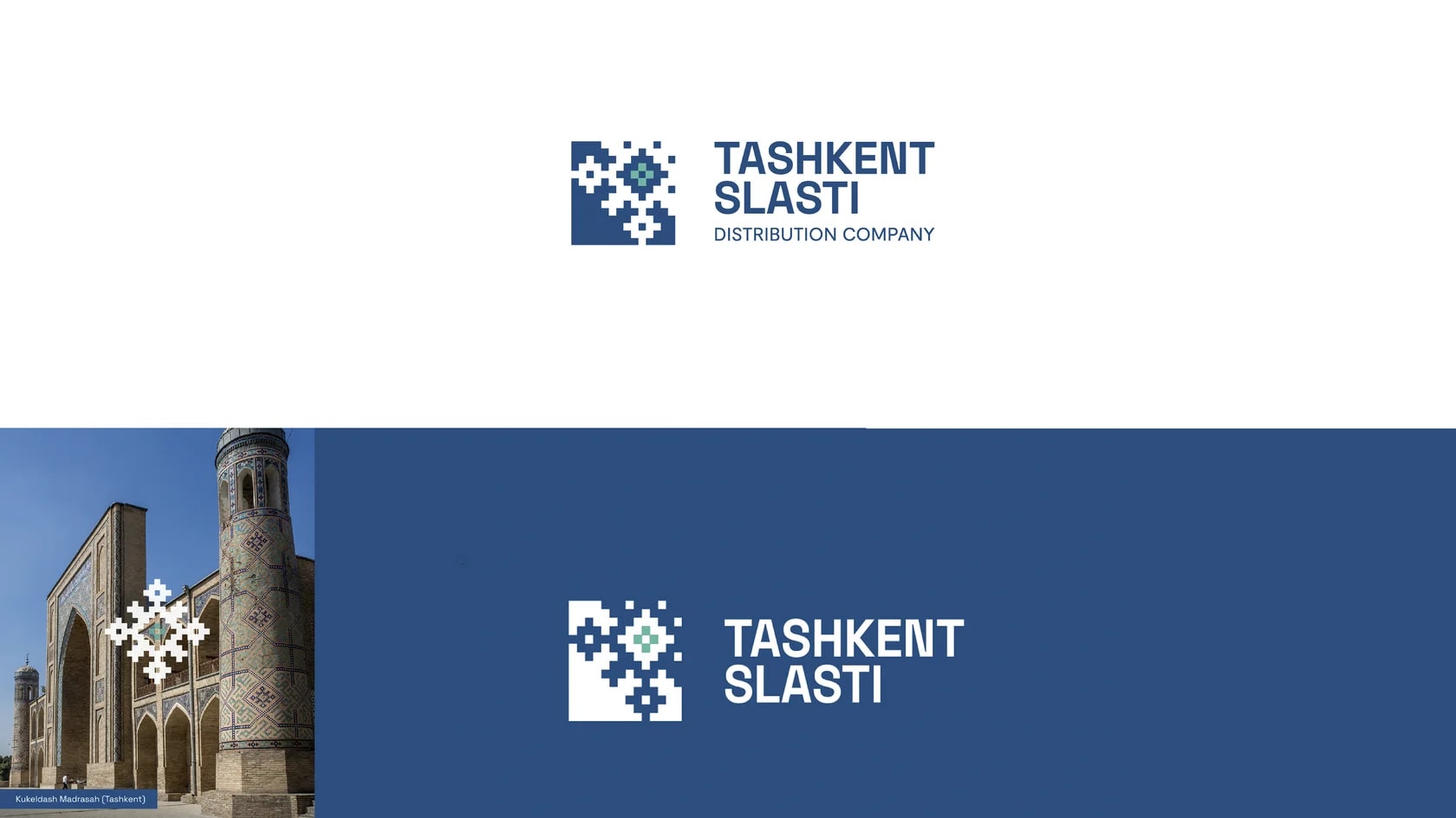
We drew inspiration from the mosaic patterns on the minaret of Kukeldash Madrasah and transformed them into a bolder and more recognizable sign. This element refers both to the spirit of old Tashkent and to pixel-style graphics, allowing the logo to combine national motifs with a modern aesthetic.
Next projects
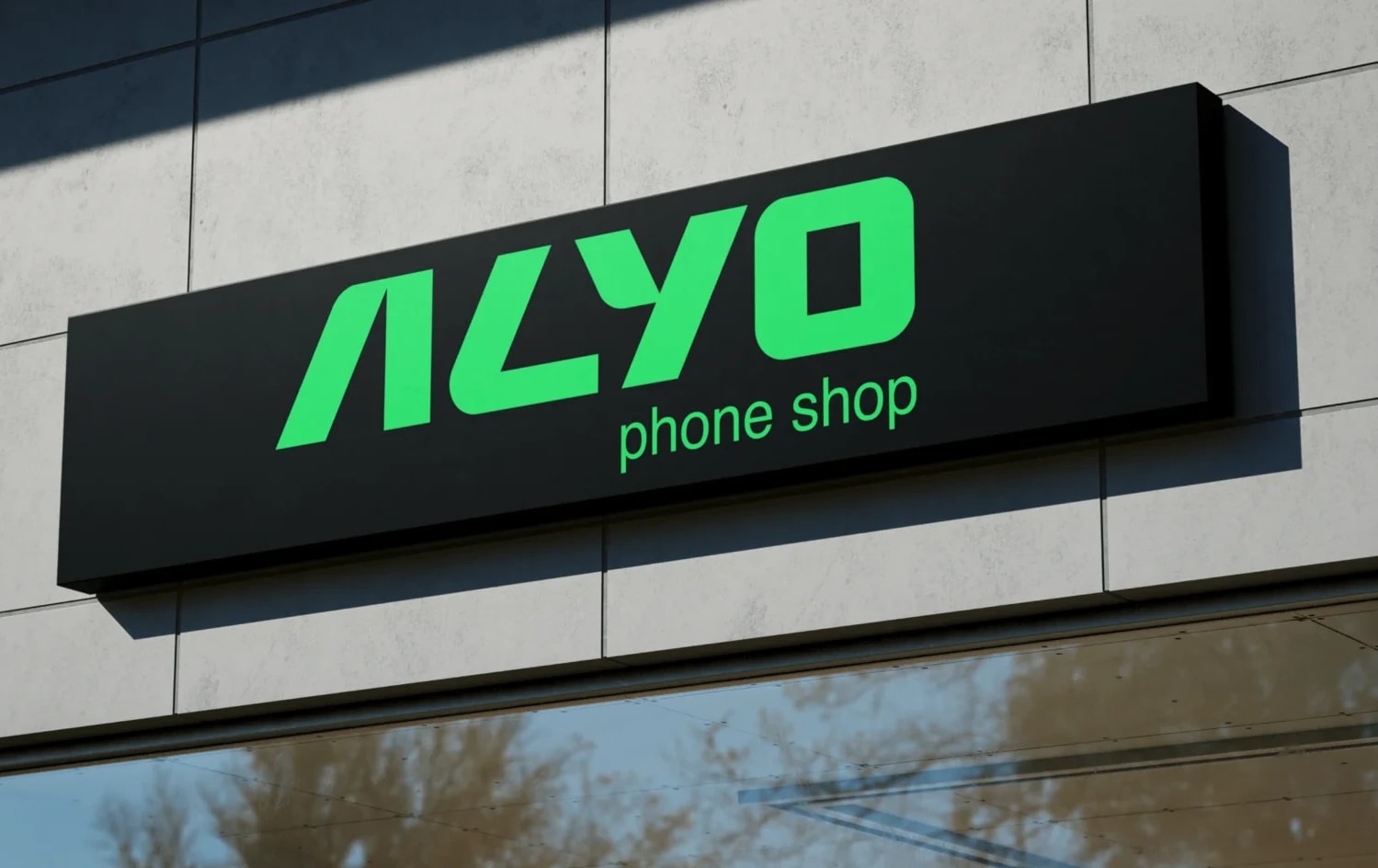
Alyo — smartphone retail
Alyo is a smartphone retailer offering installment payment options. Its visual identity is built around technology, accessibility and trust.
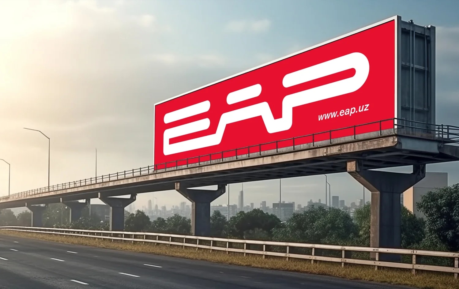
EAP — auto parts company
EAP (Euro Auto Parts) is a company with 18 years of experience in supplying spare parts for European trucks. Its portfolio includes more than 5,000 types of parts, while reliability, safety and stability remain at the core of the brand.