WorksAuto parts
EAP
About the client
EAP (Euro Auto Parts) is a company with 18 years of experience in supplying spare parts for European trucks. Its portfolio includes more than 5,000 types of parts, while reliability, safety and stability remain at the core of the brand.
Task:
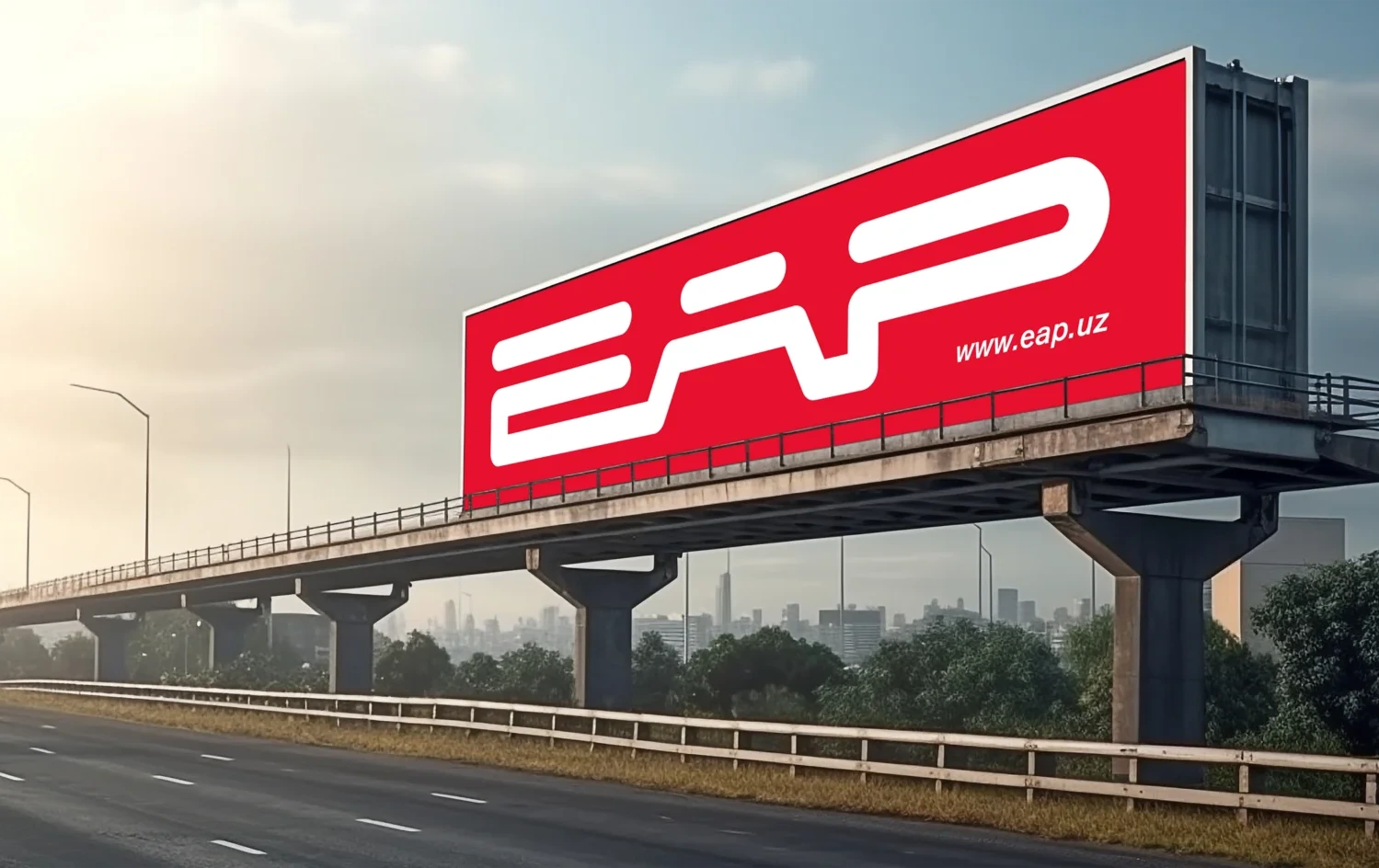
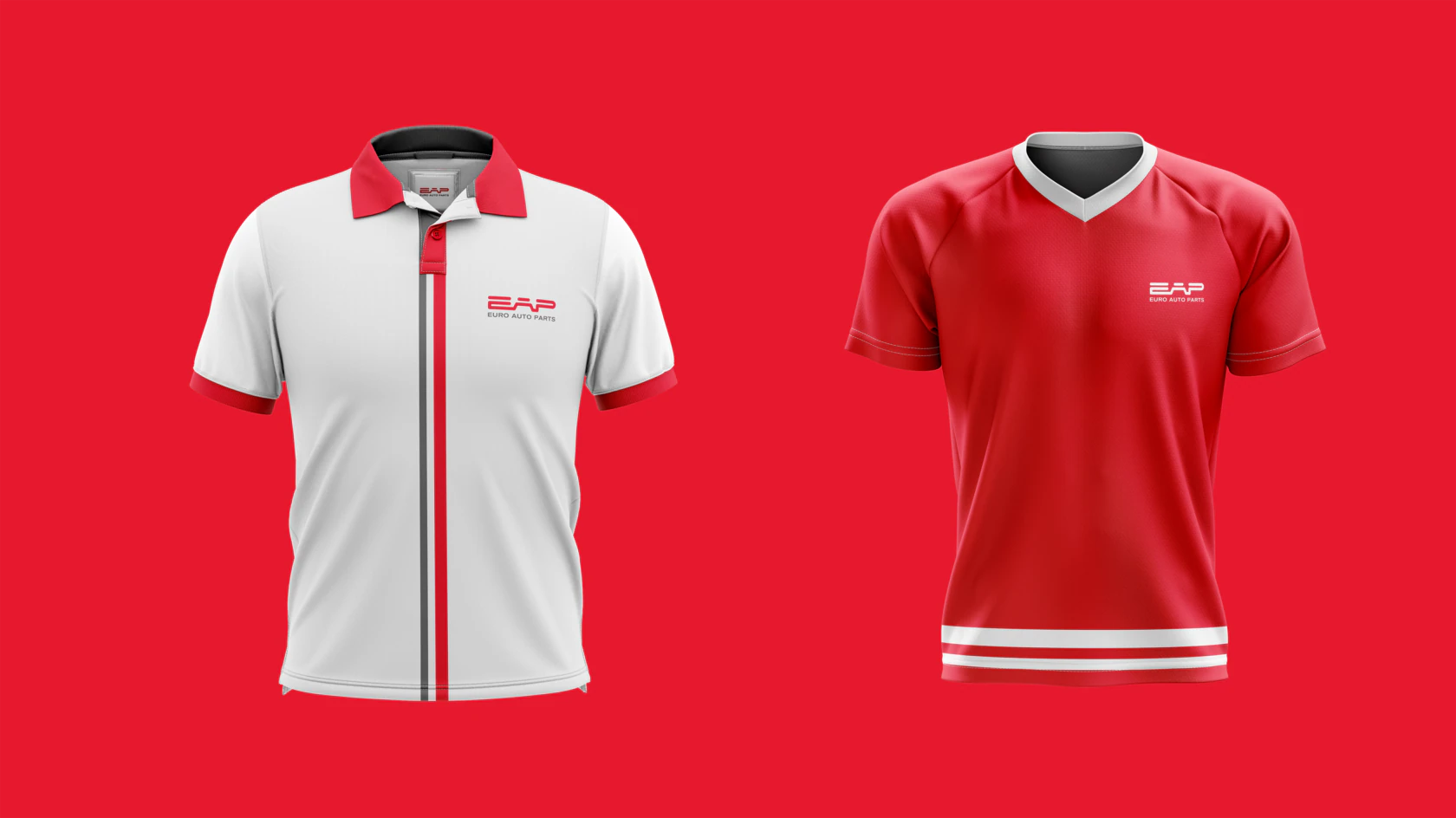
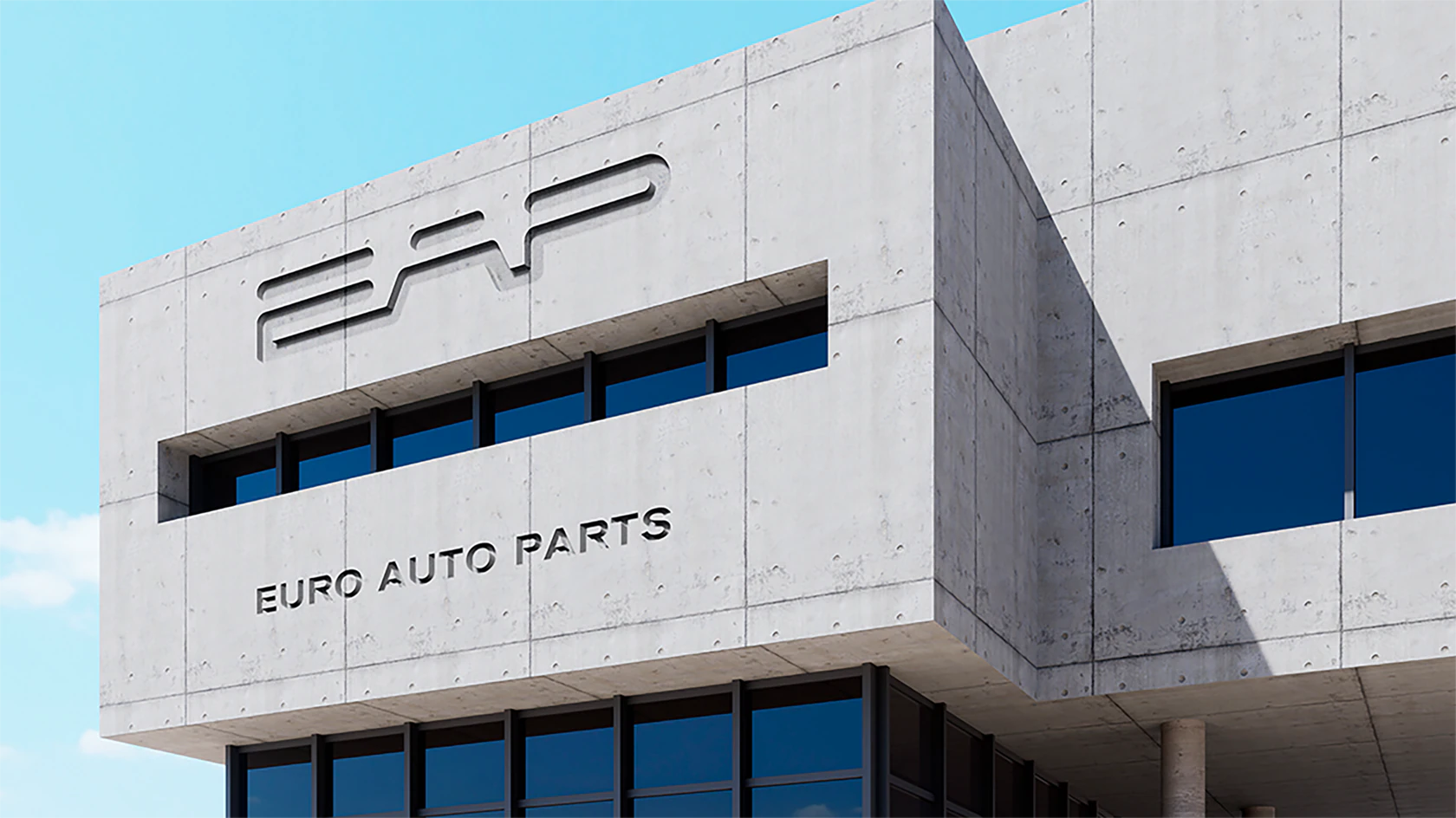
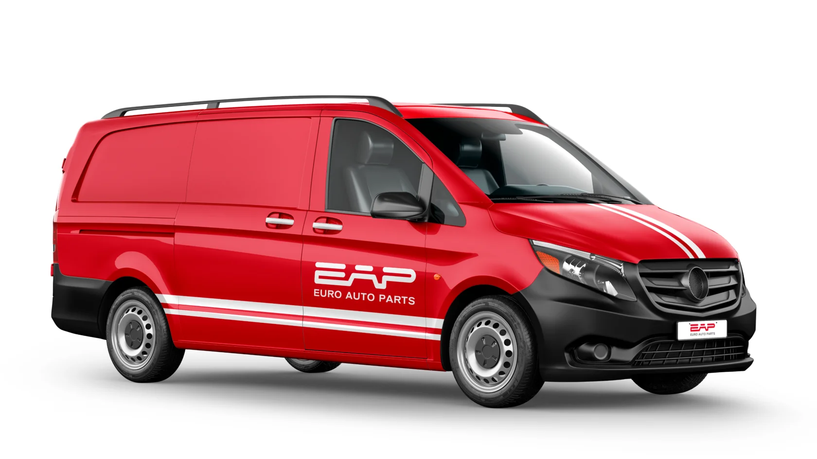
Refresh the existing logo while preserving the brand’s recognition and original concept. The key goal was to improve its geometry and proportions while giving the identity a more modern and professional appearance.

Solution
- We refined the logo using a GRID system, correcting its proportions and visual balance. The elongated lines symbolize roads, movement and steady growth, while the smooth geometry reflects transparency, reliability and the company’s honest approach to its customers.

Next case · 25 / 52
Unidaily
View