Hamkor Telekom — logo for an internet provider and LED advertising
Hamkor Telekom works in two directions: internet service and LED-screen banner advertising. The company needed a mark that looks equally confident on a connection contract and on a glowing roadside screen.
Task:
Two businesses, one brand. The logo had to unite internet service and outdoor LED advertising, read at a glance and feel serious: a provider's customers trust stability, not decoration. Our key insight: the letter H already has room for a second letter — T. You just have to work with empty space rather than lines.
Solution:
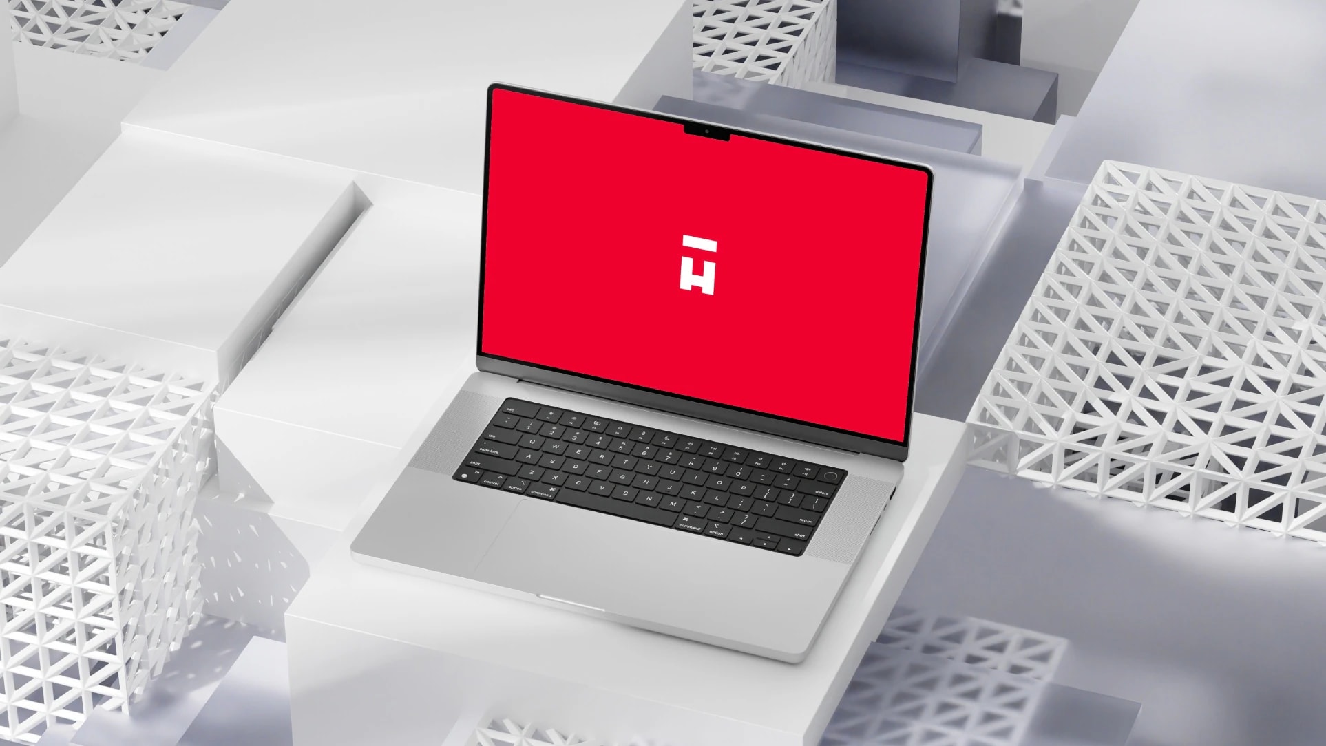
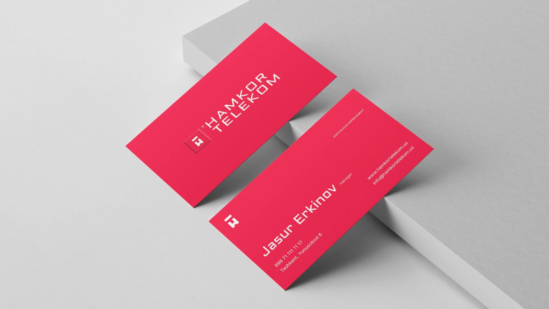
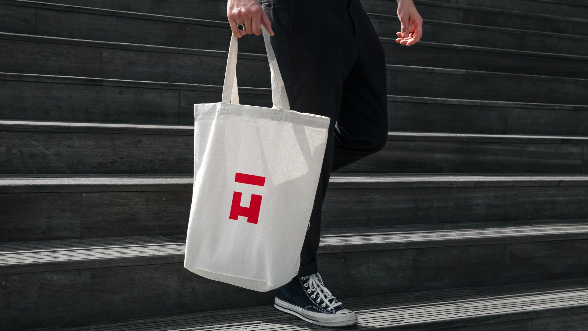
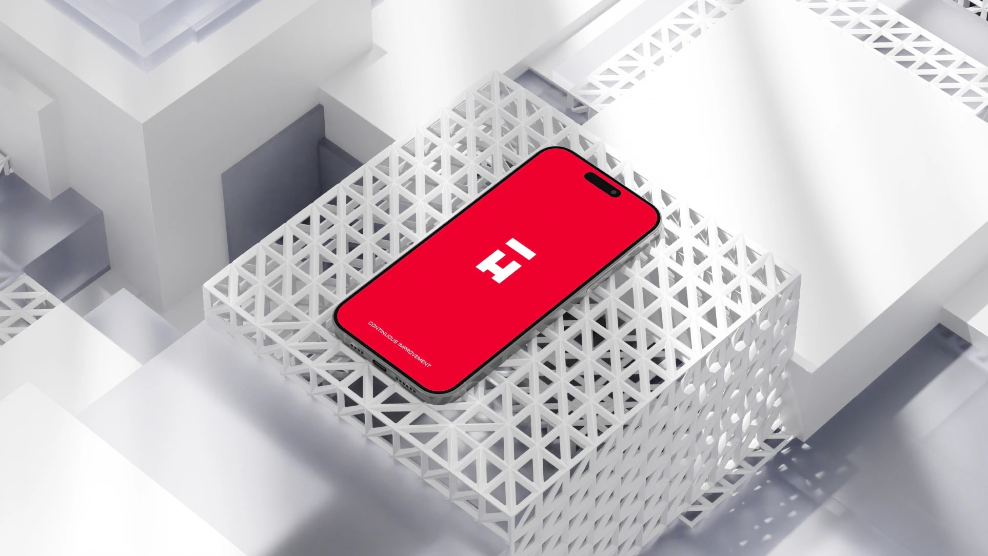
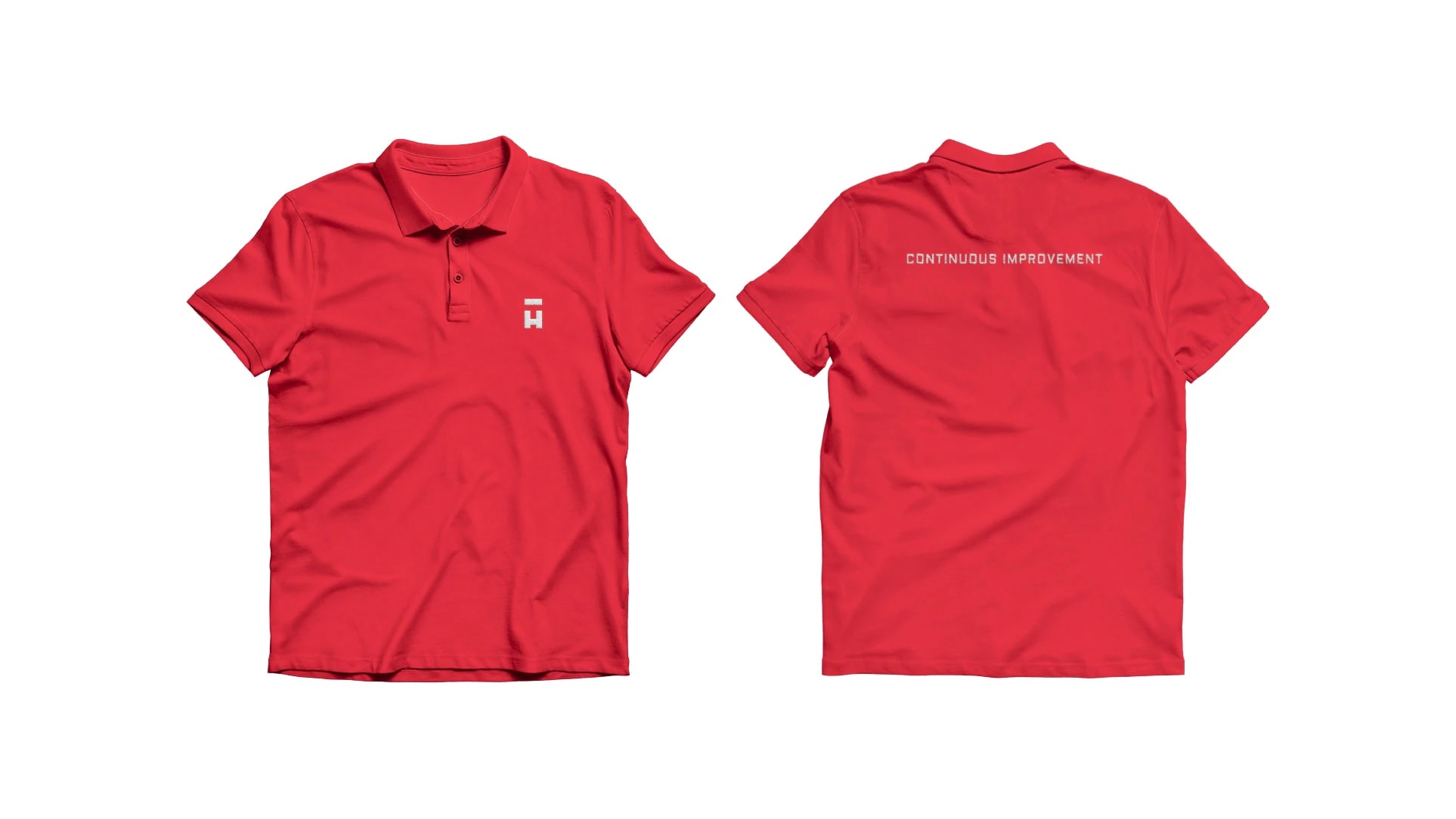
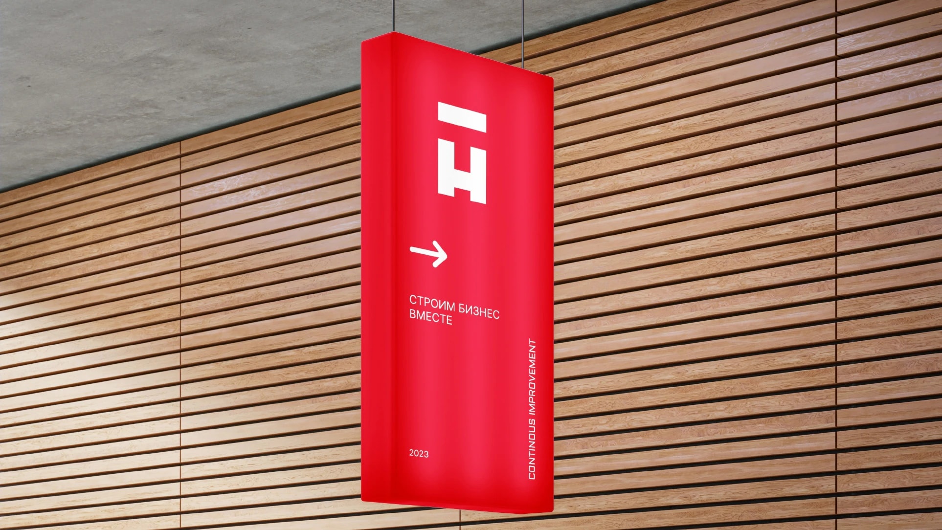
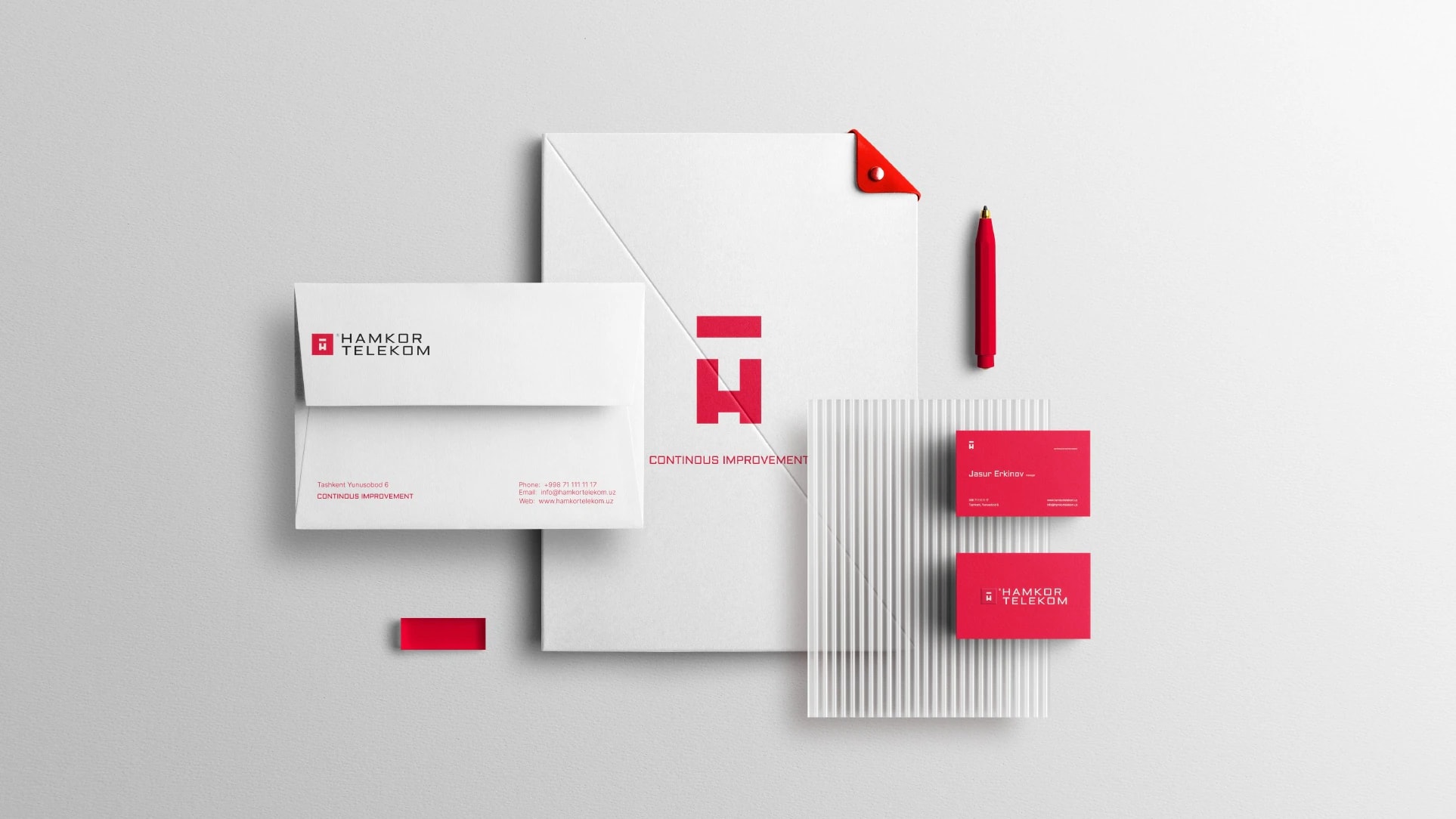
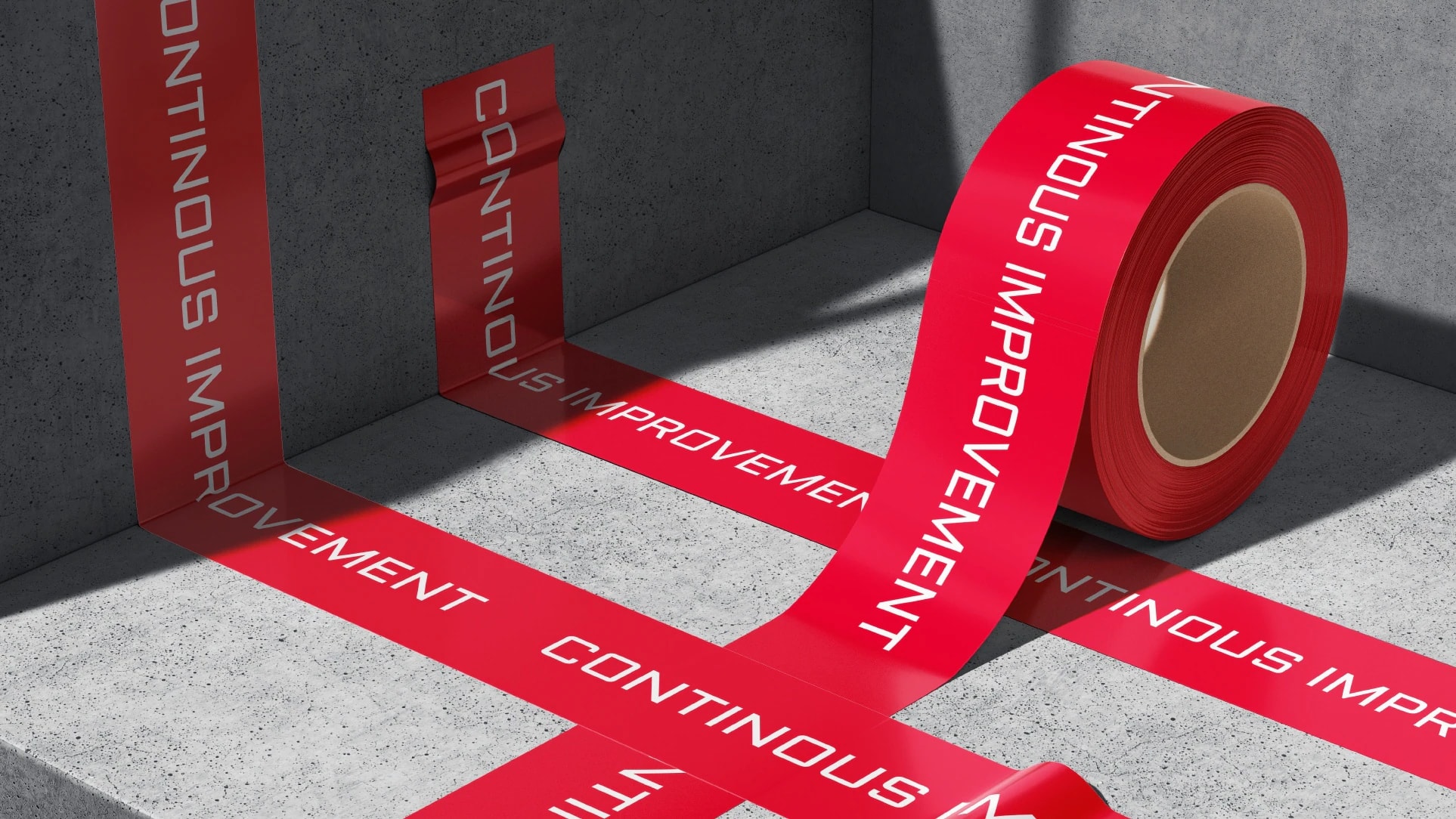
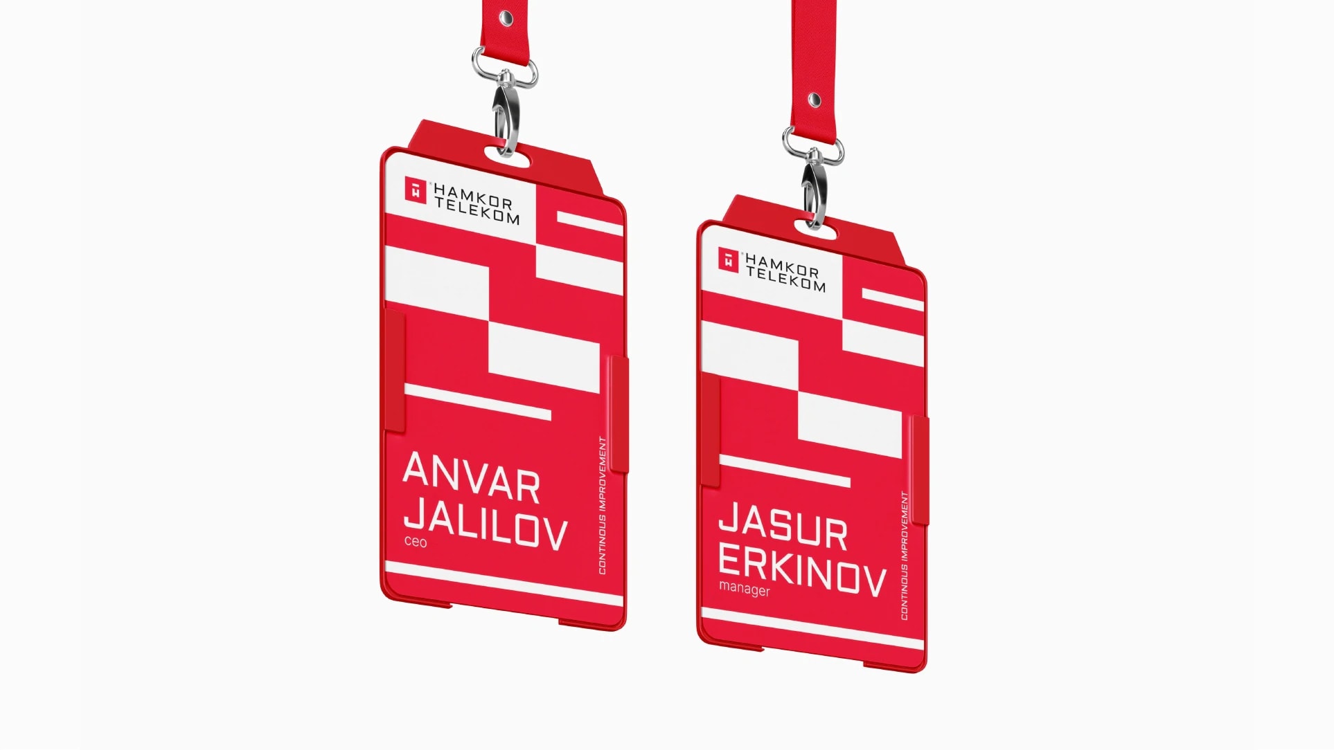
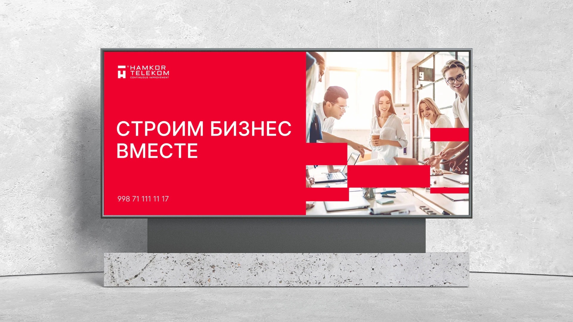
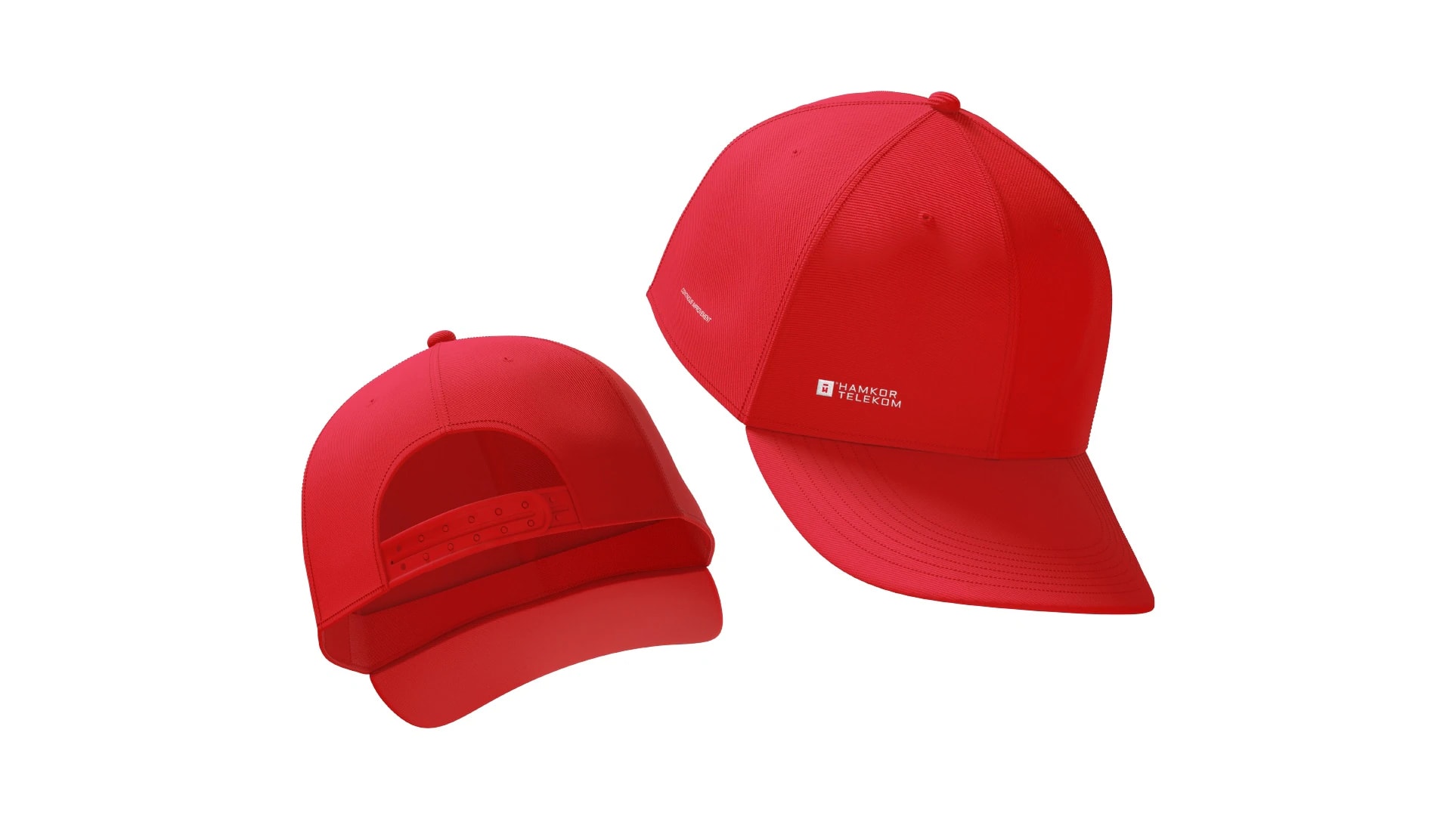
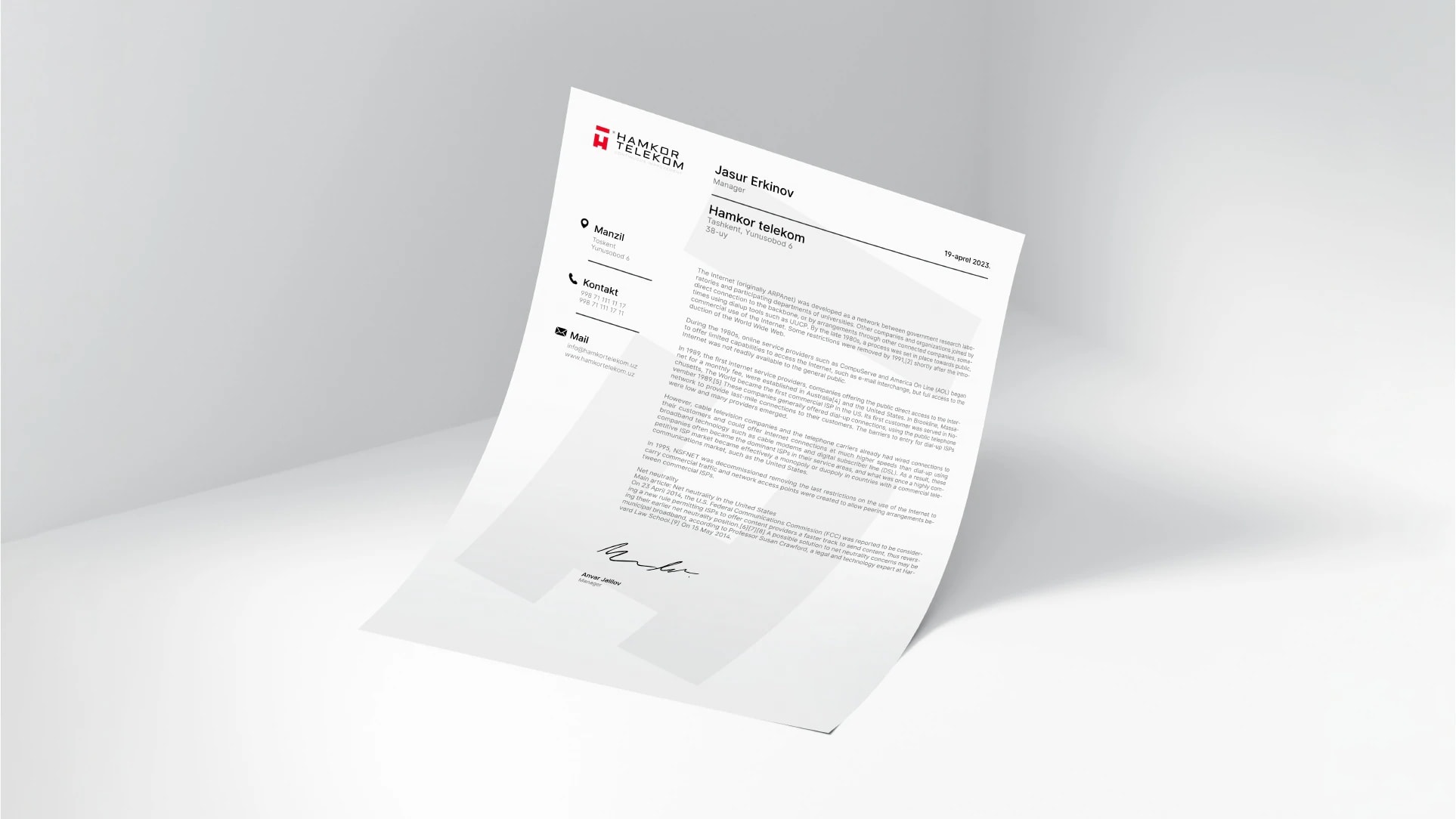
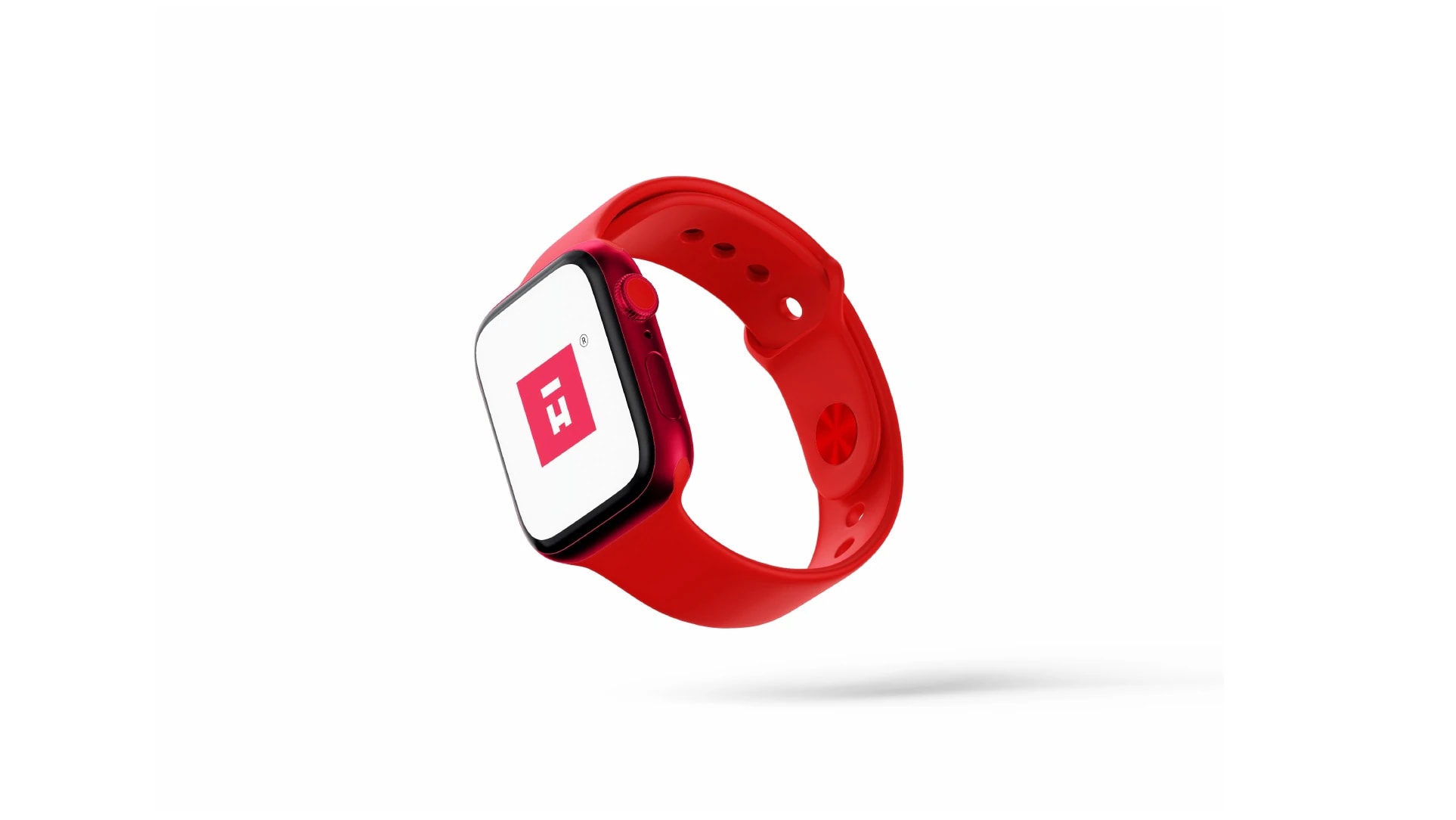
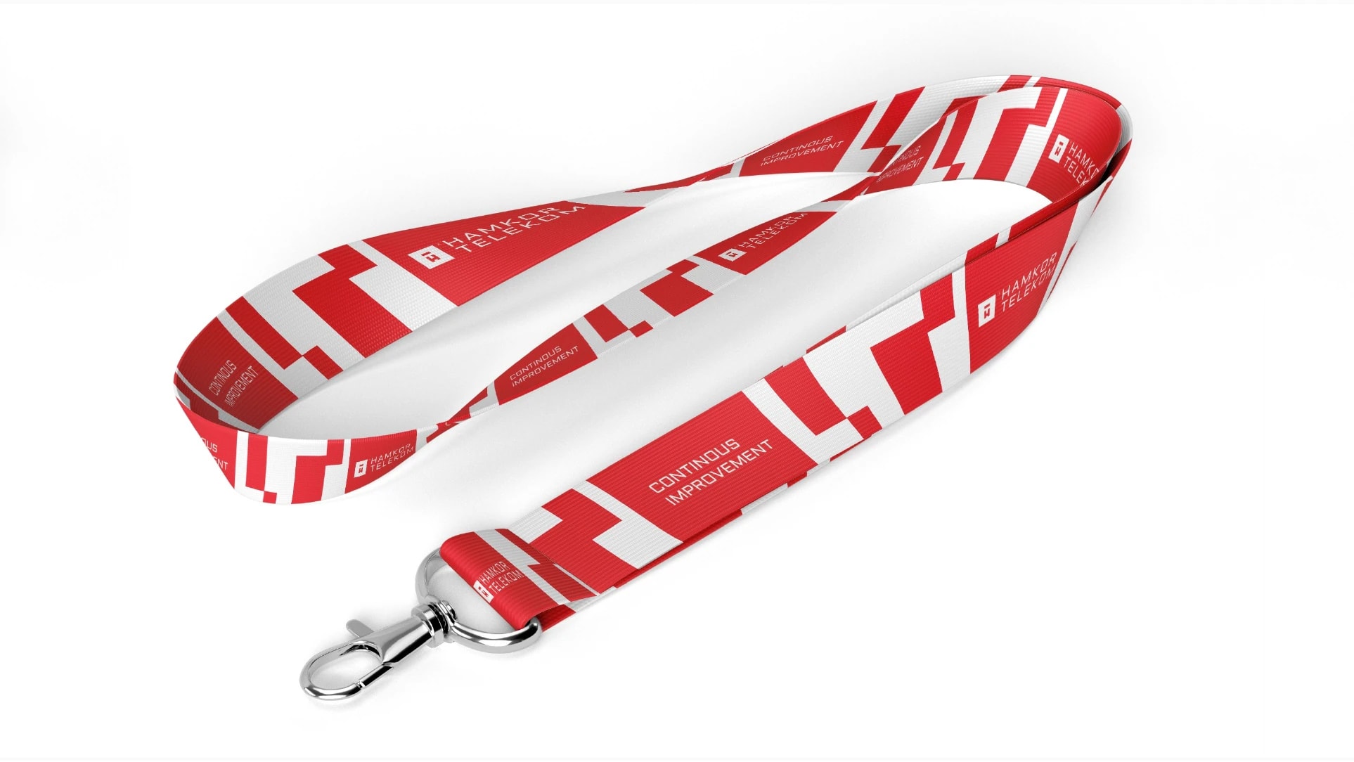
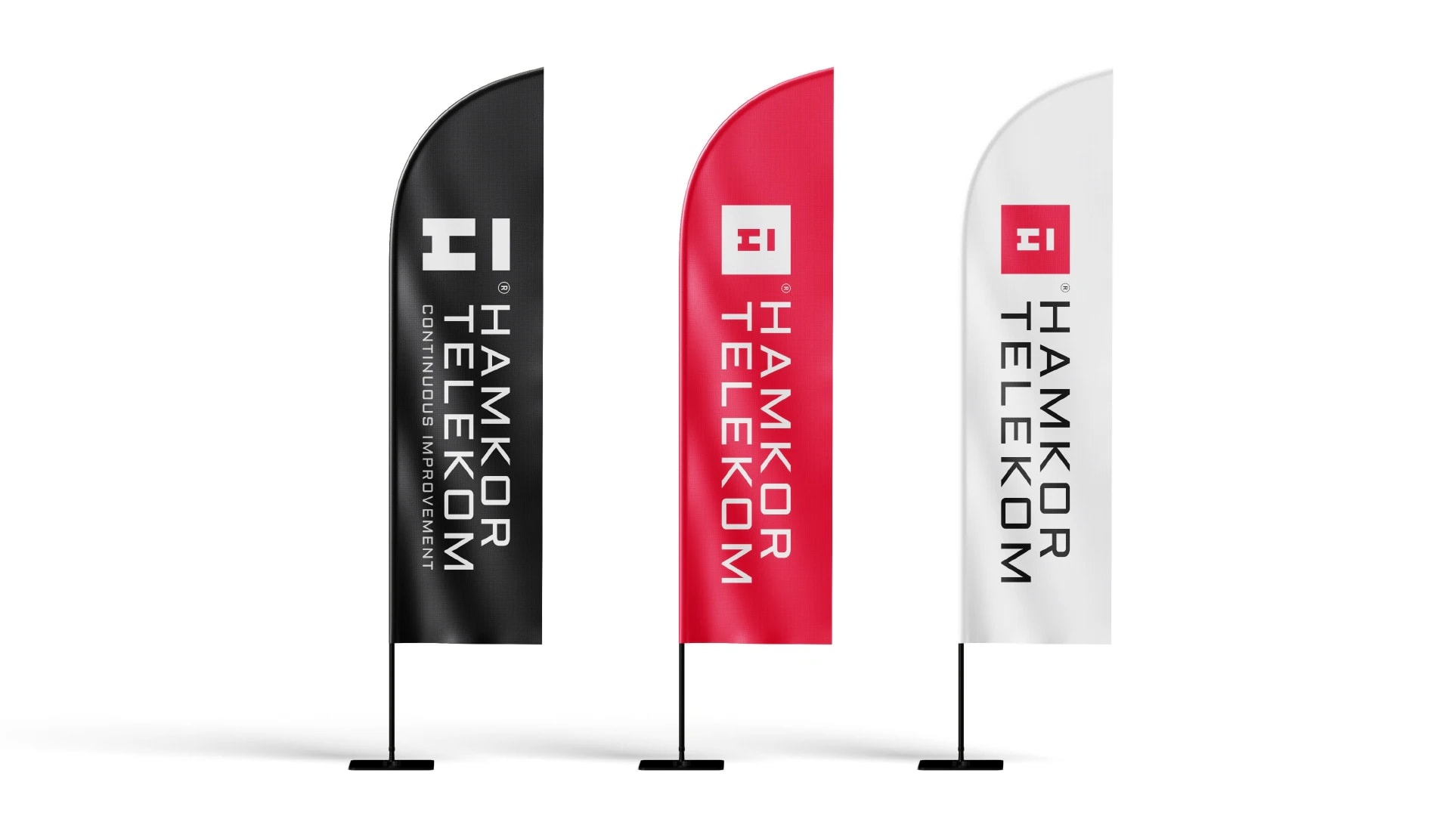
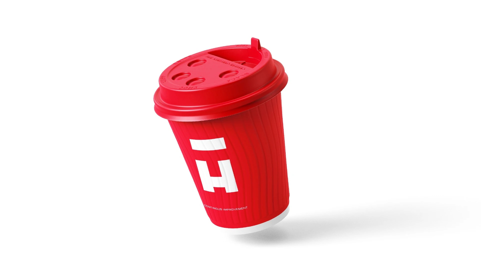
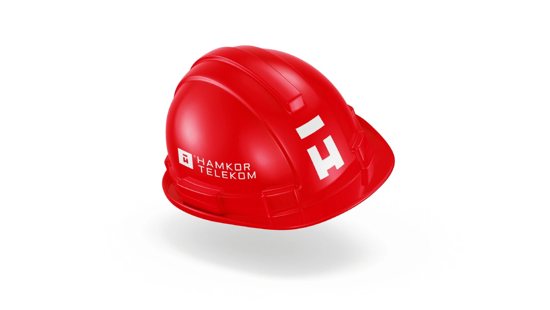
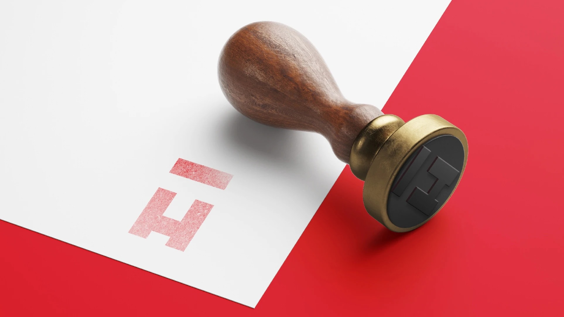
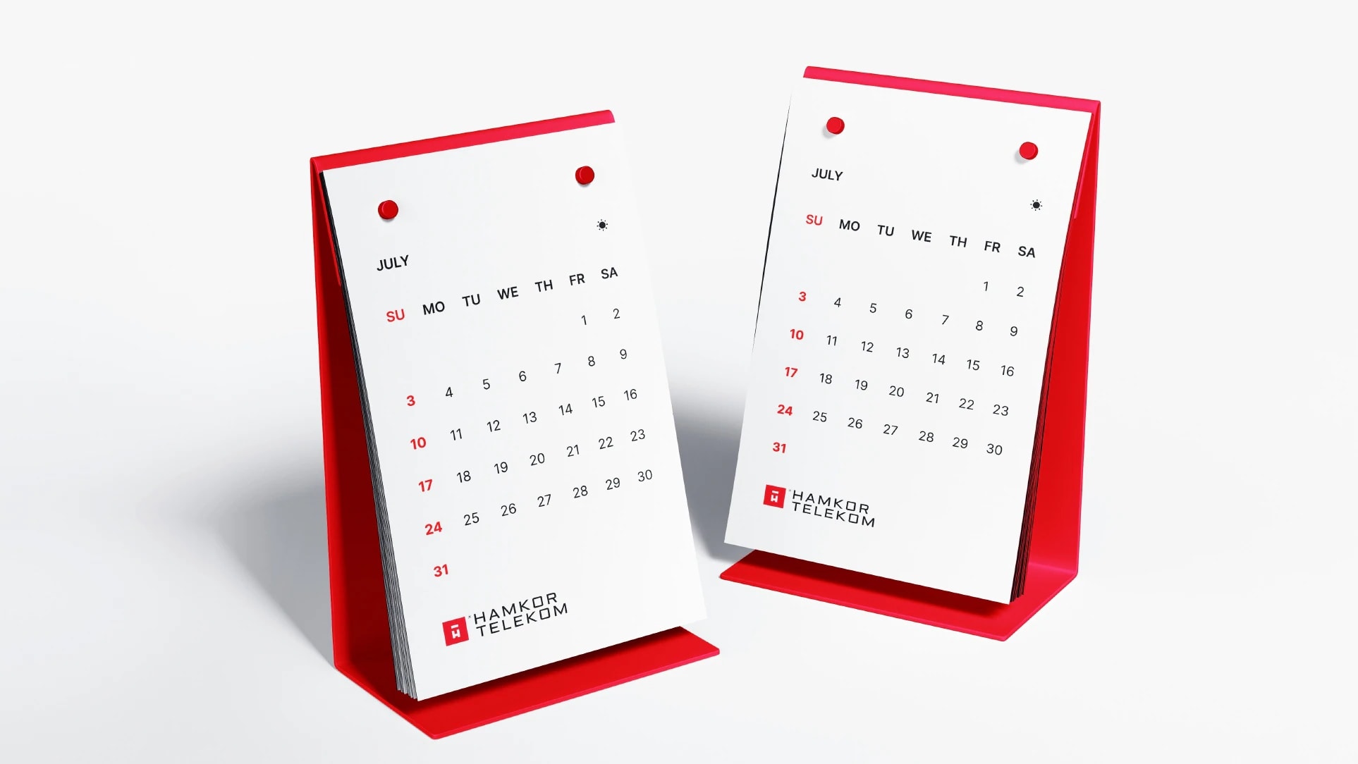
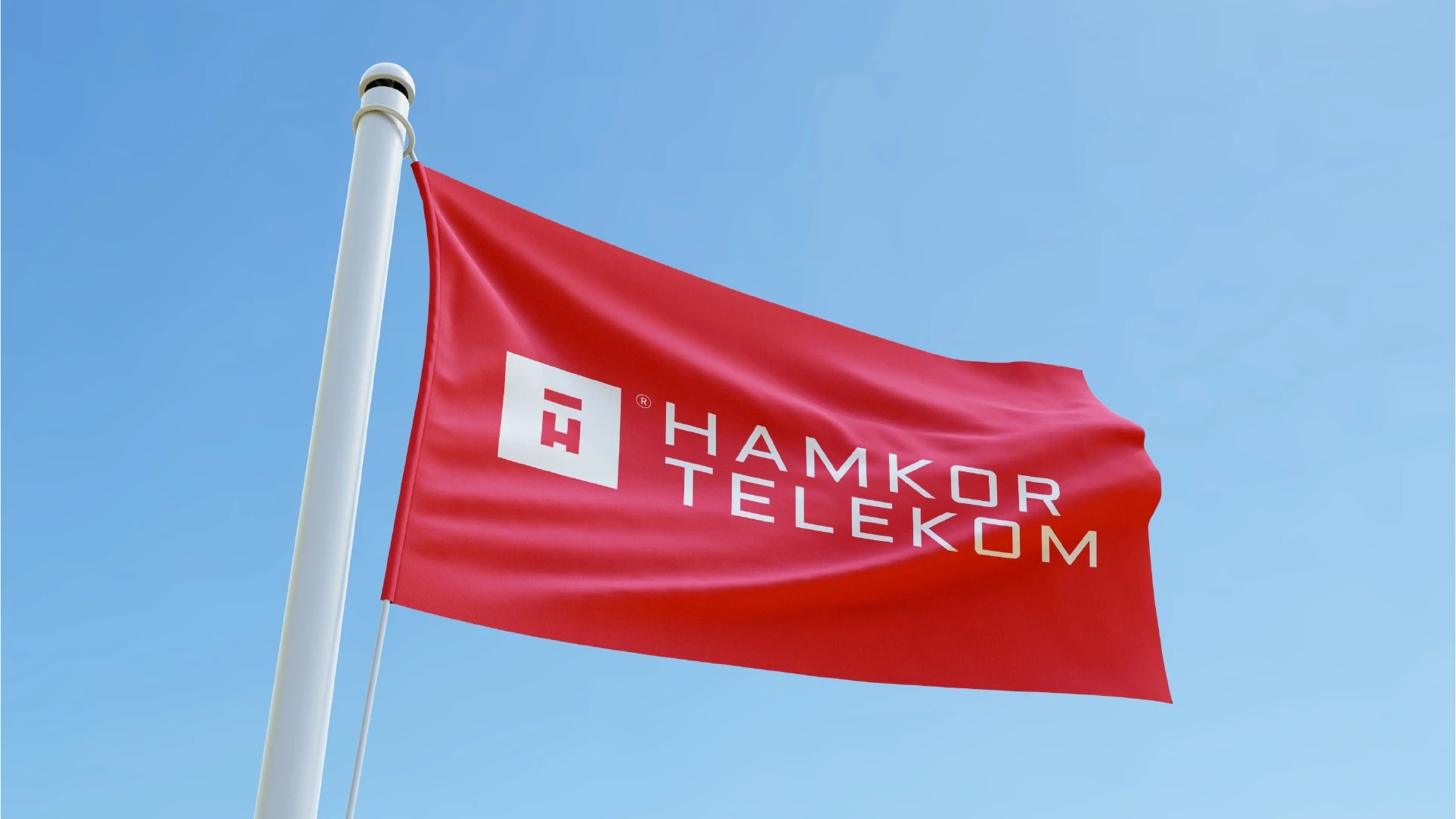
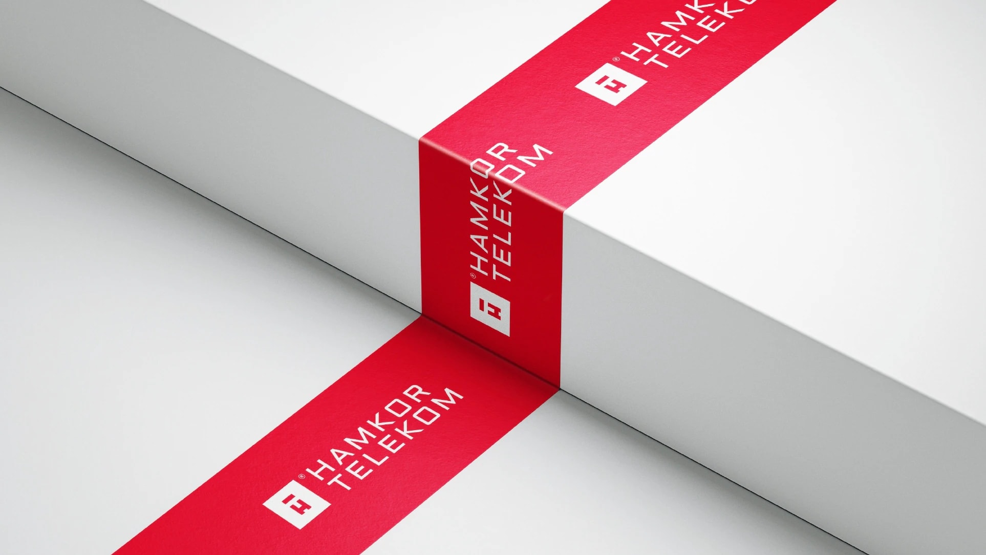
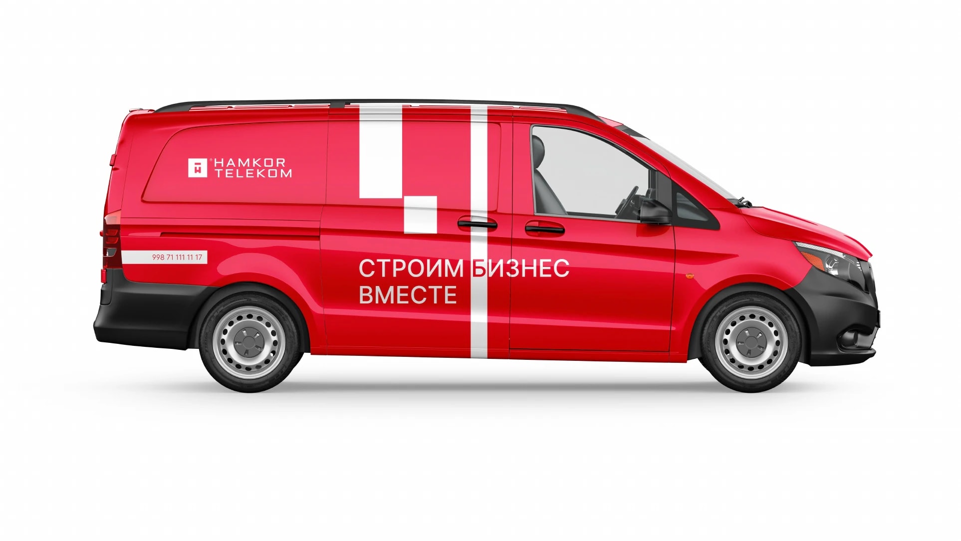
The mark is built in a strict style of straight lines and sharp corners. The white H is the company's initial, and its empty space skilfully reveals a T through negative space. The white rectangle on top points to the company's second direction — LED screens and banners. The name is set in a fitting typeface, with the English slogan “Continuous improvement” beneath it. The signature red, the guidebook and the applications — from business cards and badges to flags, uniforms and a branded van — form one system that works both in the office and on the street. Like the idea? Write to us and let's talk about your project.





Next projects

RiaPlast — logo for a plastic pipe manufacturer
A manufacturer of plastic pipes and plumbing products came to us for a logo. The name was already in place: RIA, the initials of the three founders, plus the word Plast. Our job was to turn the abbreviation into a mark that tells you what the company does.

HerboLabz — logo for a dietary supplement manufacturer
A dietary supplement manufacturer came to us for a logo. The mark had to show what the company does at a glance: natural ingredients and laboratory work.