Mega Food — logo for a food supply company
Schools, kindergartens and other institutions wait for fresh food every day — and Mega Food delivers it on time. For this company we created a logo that explains the business without a single word.
Task:
Mega Food supplies food products to schools, kindergartens and other organizations. The company needed a mark that explains what it does at first glance and sticks in memory — on a van, on a box, on a staff uniform. For us it was not about a pretty picture, but about a logo equally clear to a school principal and a driver on the highway.
Solution:
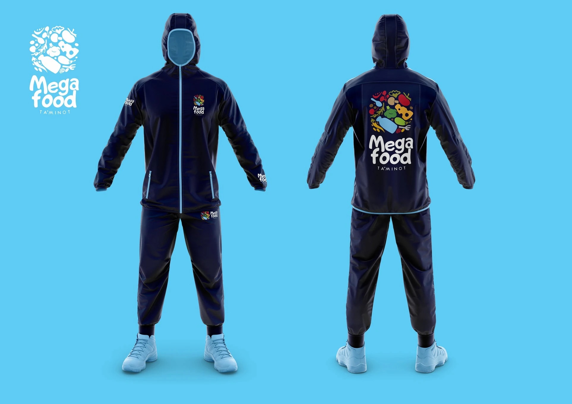
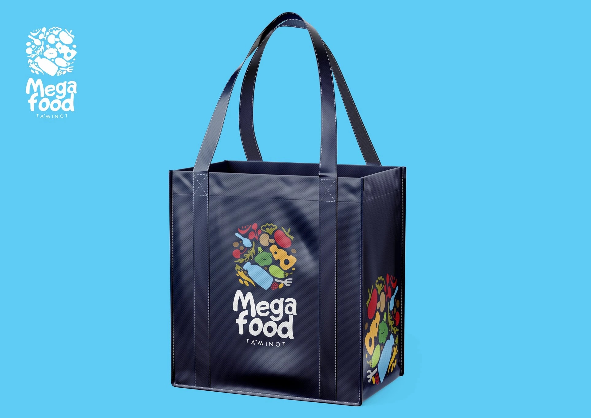
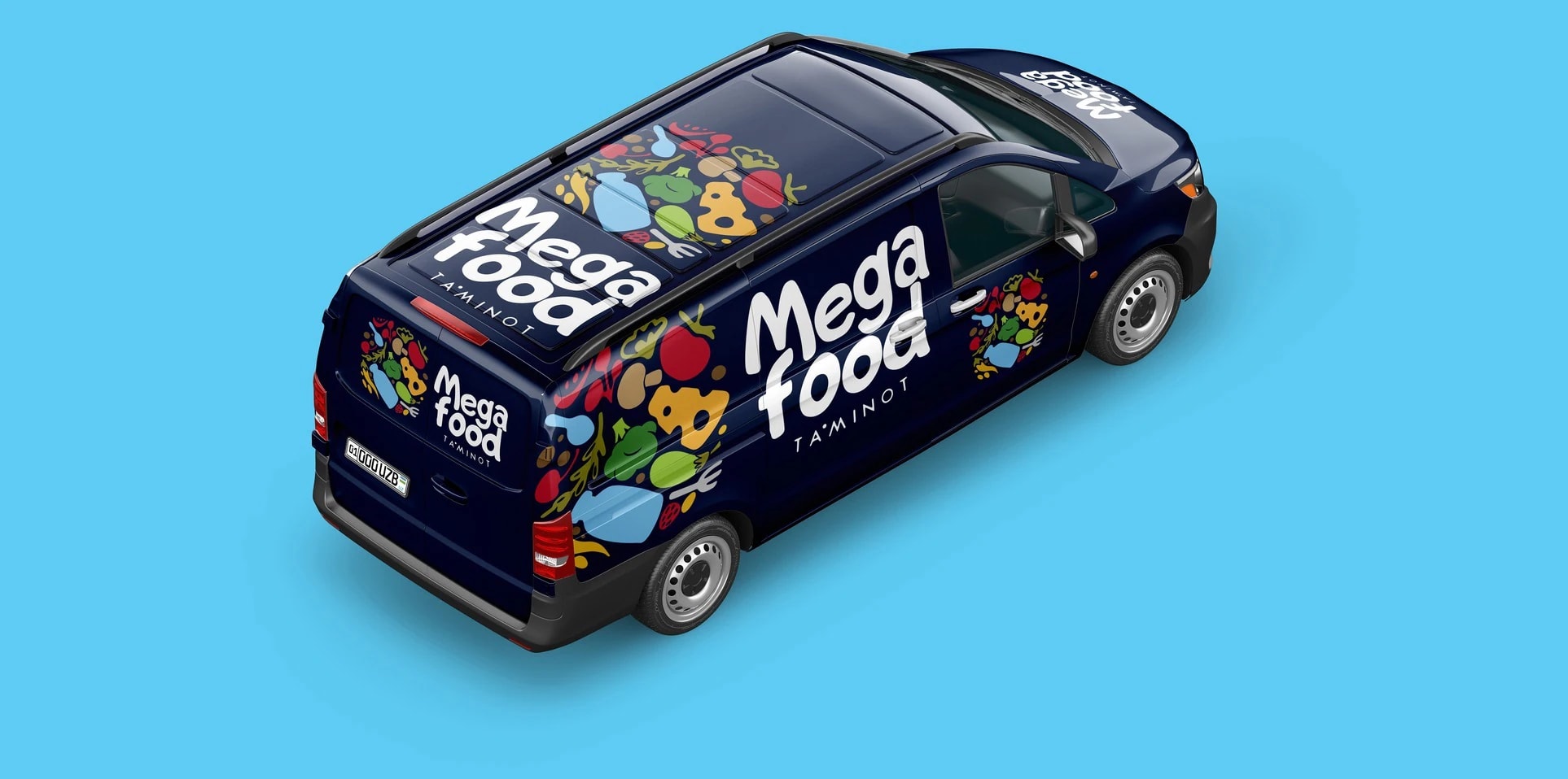
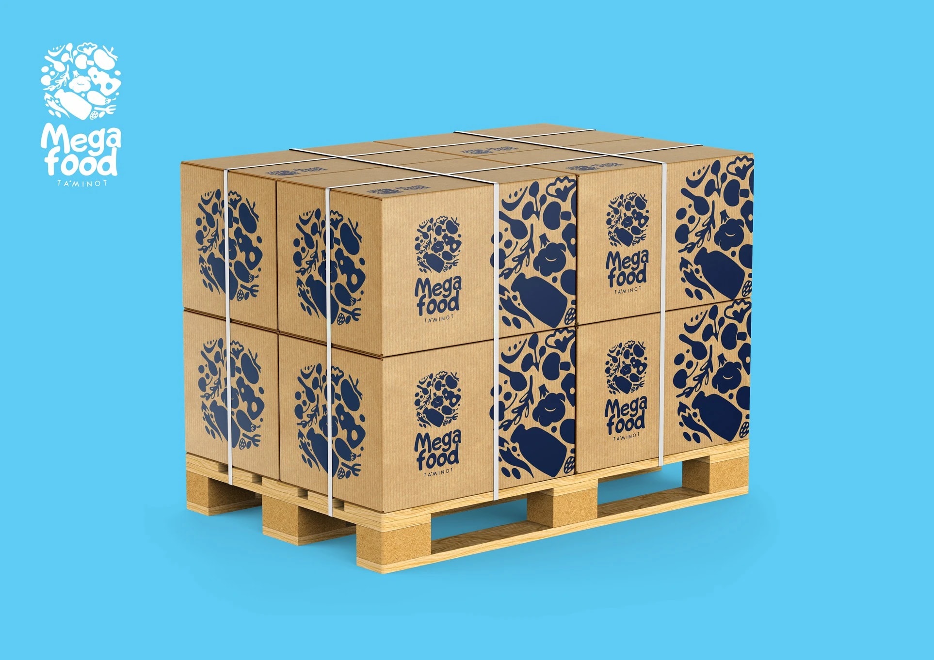
We kept the logo simple and clear: a variety of food products drawn in 2D come together into one solid composition. Such a mark gives a clear idea of what the company does and makes it more likely to be remembered. What is more, the logo works as a pattern: products “spill” across the sides of vans and trucks, boxes, bags and packaging. To show the logo at its best, we presented it across different touchpoints: staff uniforms, a tote bag, trucks, vans, packaging, a barrel and boxes on a pallet. The deep navy background makes the products even brighter — the brand reads in a second, even in traffic.







Next projects

Sirius — logo for a medical center
Sirius is the brightest star we can see in the night sky. For centuries, many peoples have seen it as a symbol of goodness. For those who come seeking healing, Sirius medical center is meant to be a symbol of rescue — and that is where our logo began.

Fatimah — logo for a women's wellness center
An elegant logo for an elegant audience. Fatimah is a comprehensive wellness center for women, a place where women can rest in body and mind, restore their health and grow their self-confidence.