Sirius — logo for a medical center
Sirius is the brightest star we can see in the night sky. For centuries, many peoples have seen it as a symbol of goodness. For those who come seeking healing, Sirius medical center is meant to be a symbol of rescue — and that is where our logo began.
Task:
As always, we began the logo with study, research and analysis — and first of all, we found out why the center is called Sirius. So our first proposal was to express the shape of a star. The star is a familiar sign for us: — stars appear on the flag and coat of arms of our country; — Leonardo da Vinci's Vitruvian Man, which depicts the ideal proportions of the human body, hints at the shape of a star. The idea of a healthy person fits a medical center perfectly. The task was to create a mark that looks simple at first glance, yet carries meaning and inspires trust.
Solution:
The five points of the star stand for the five core goals of the medical center: 1. High qualifications and experience. 2. Modern equipment and technology. 3. Accessible services. 4. An individual approach. 5. Innovative methods. So that the logo would not be just a star, we enriched it with a medical theme, drawing inspiration from the Star of Life — the emergency medical services symbol used in the USA and many European countries. The result is a logo that looks simple at first glance but brings many ideas together. The mark works naturally across the identity: the facade sign, wayfinding steles, staff uniforms, stationery, advertising and even wet wipe packaging.


Next projects

Fatimah — logo for a women's wellness center
An elegant logo for an elegant audience. Fatimah is a comprehensive wellness center for women, a place where women can rest in body and mind, restore their health and grow their self-confidence.
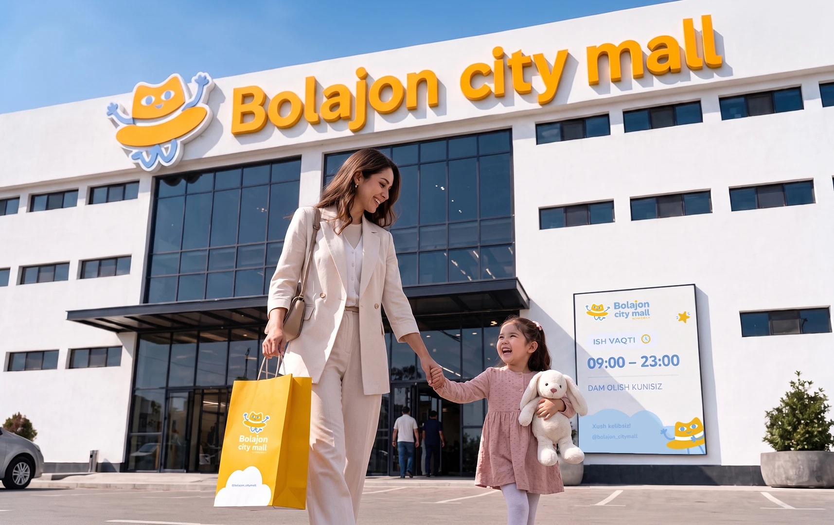
LOGO FOR BOLAJON CITY MALL
Bolajon city mall is a large family shopping complex founded by the famous blogger Jahongir Khojaev (Sariq bola). This idea stemmed from real-life struggles: mothers are constantly busy with their children and often can't find time for themselves, leaving shopping and fitness behind. To solve this problem, a complex was conceived that currently has no equivalent in Uzbekistan, bringing everything together in one place — from cauldrons, clothes, and bedding to a children's hair salon and a fitness center. The main principle is that you can find absolutely everything here.