Vodiy organics — logo and packaging for chicken eggs
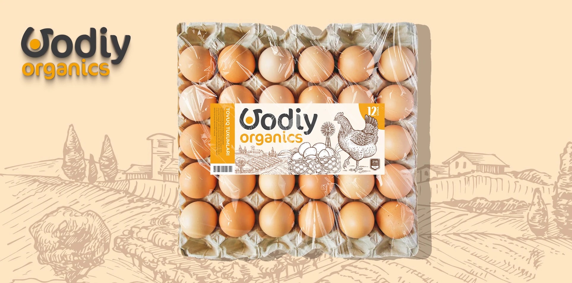
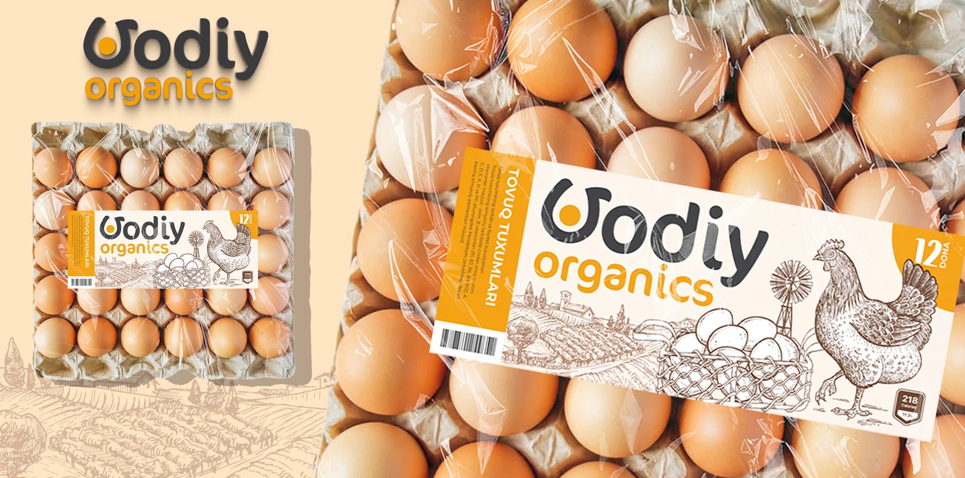
Our client, Vodiy organics, sells chicken eggs. They needed a logo and packaging that tell you what is inside at first glance.
Task:
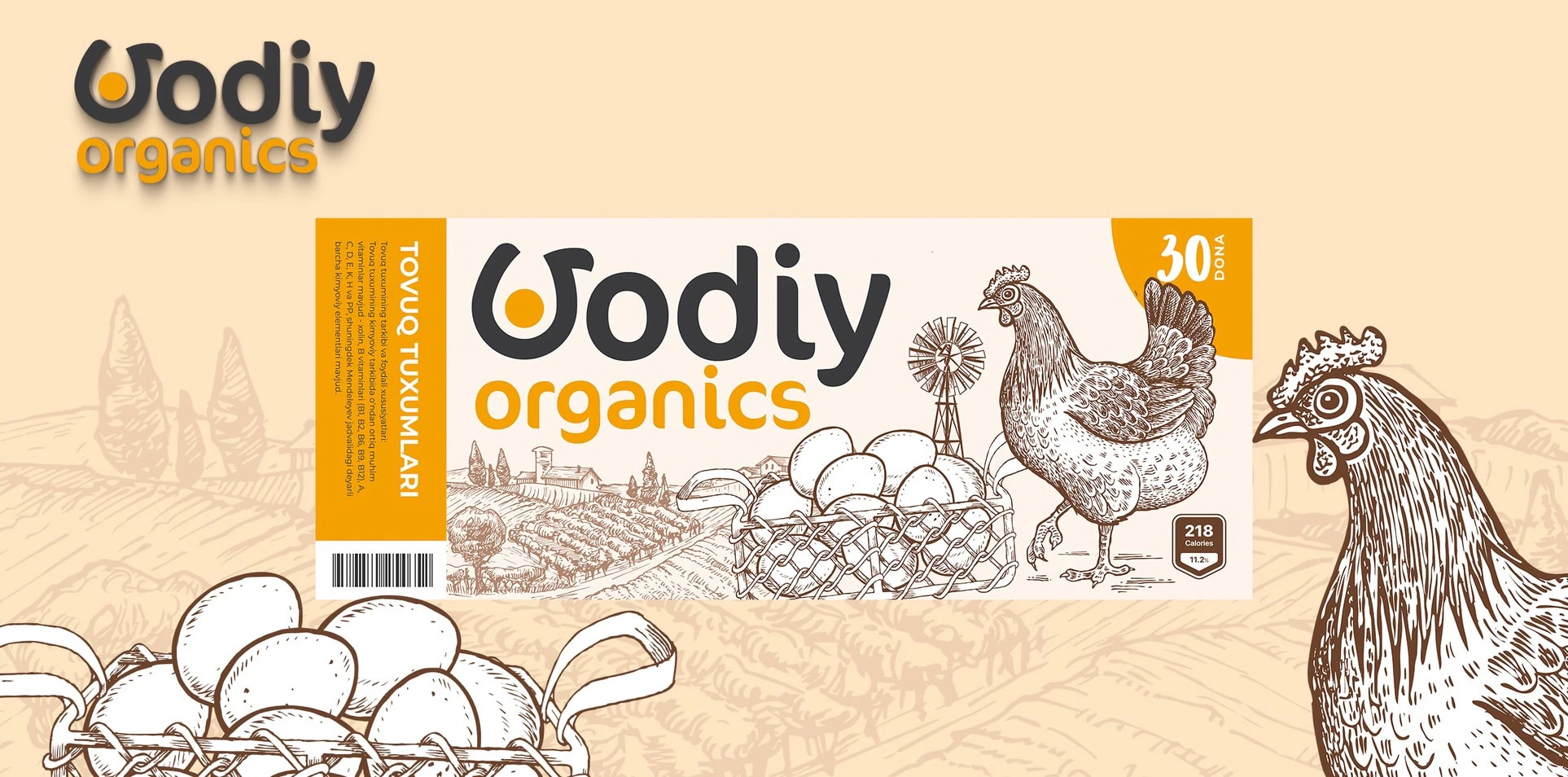
The logo had to be simple and, at the same time, show what the company does. So we took the company name as the basis and focused on its first letter — V.
Solution:
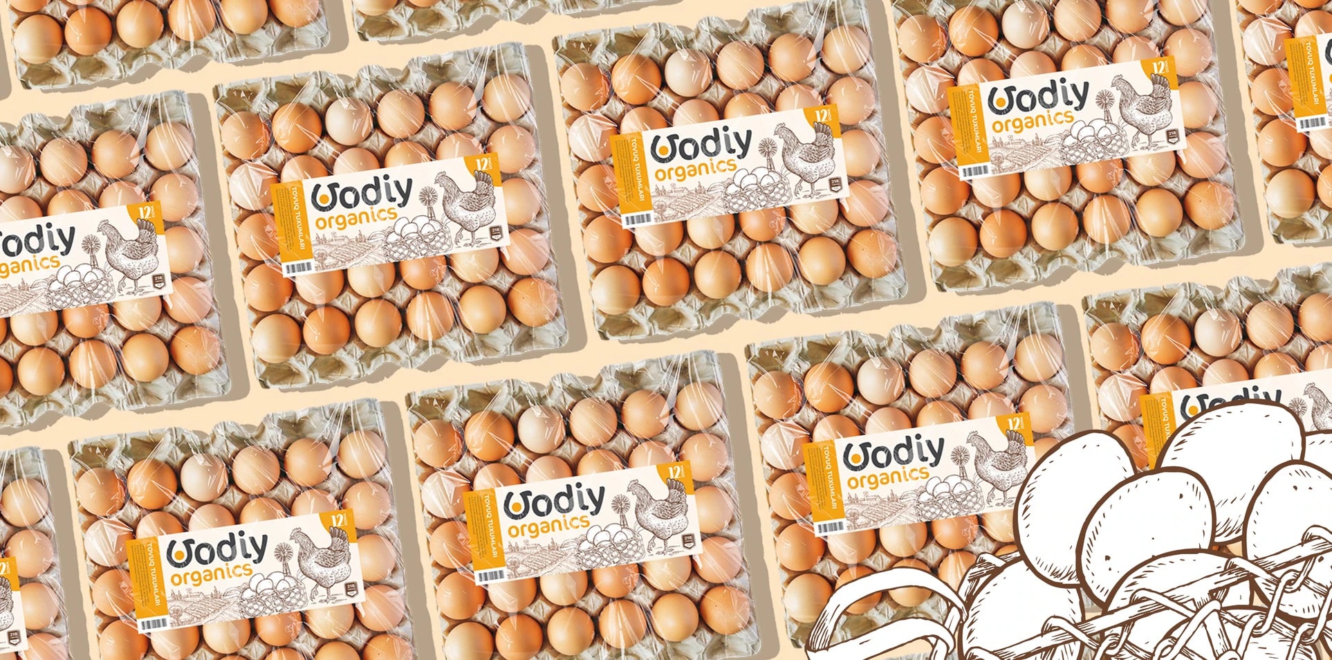
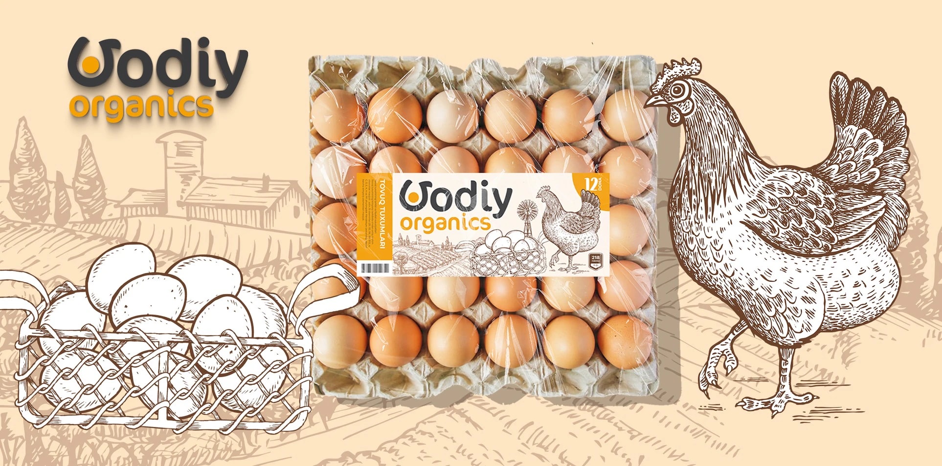
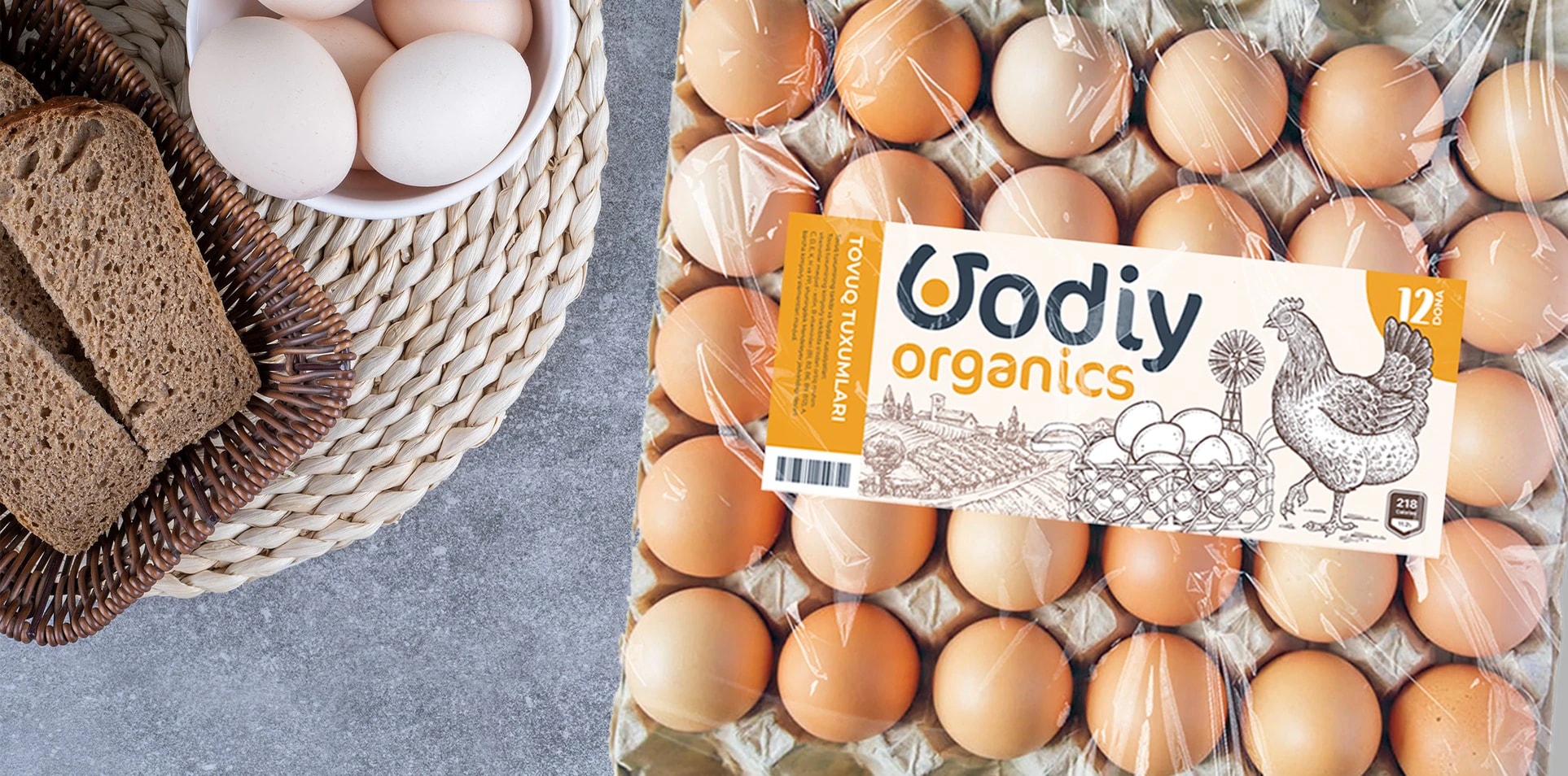
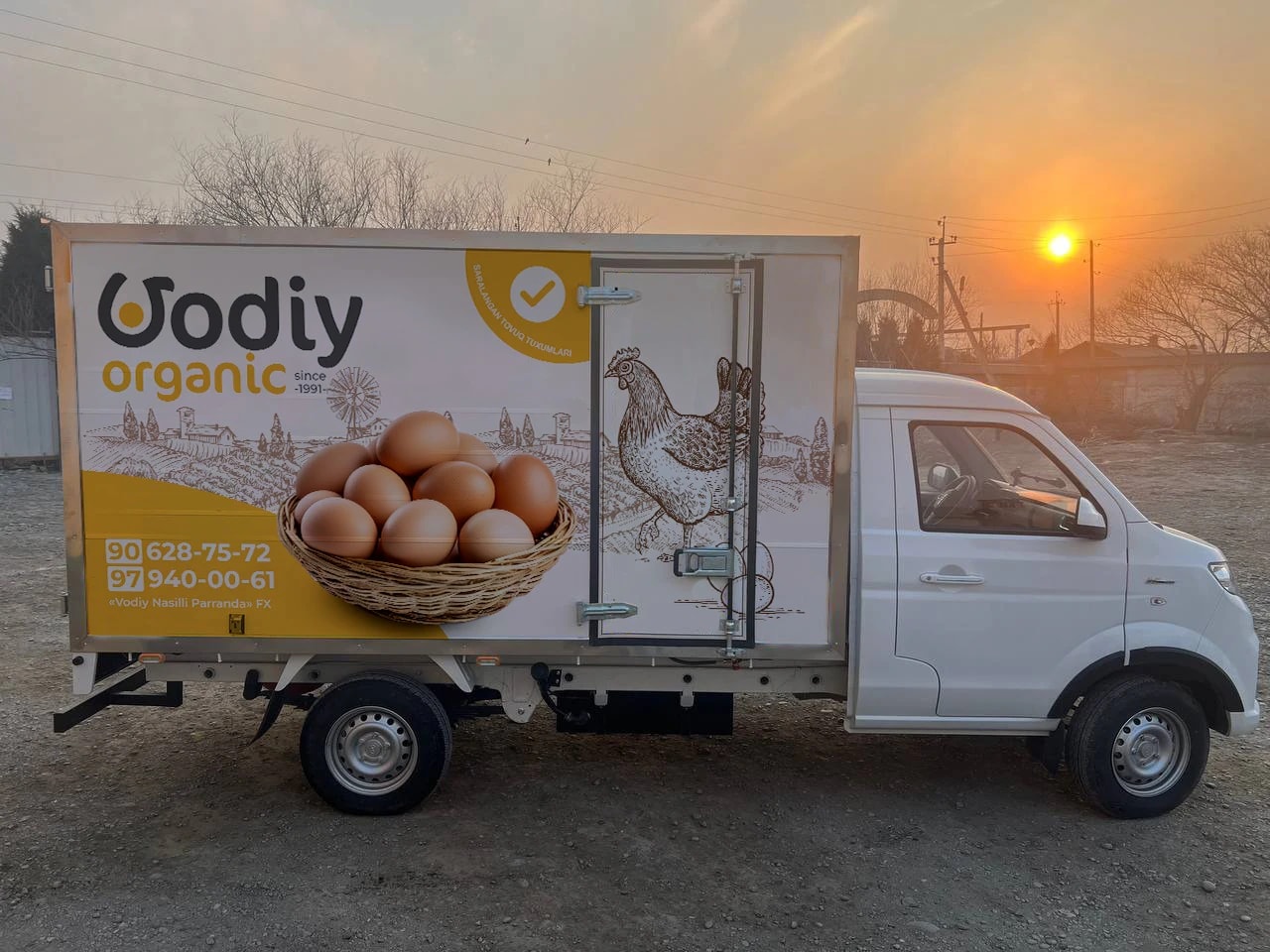
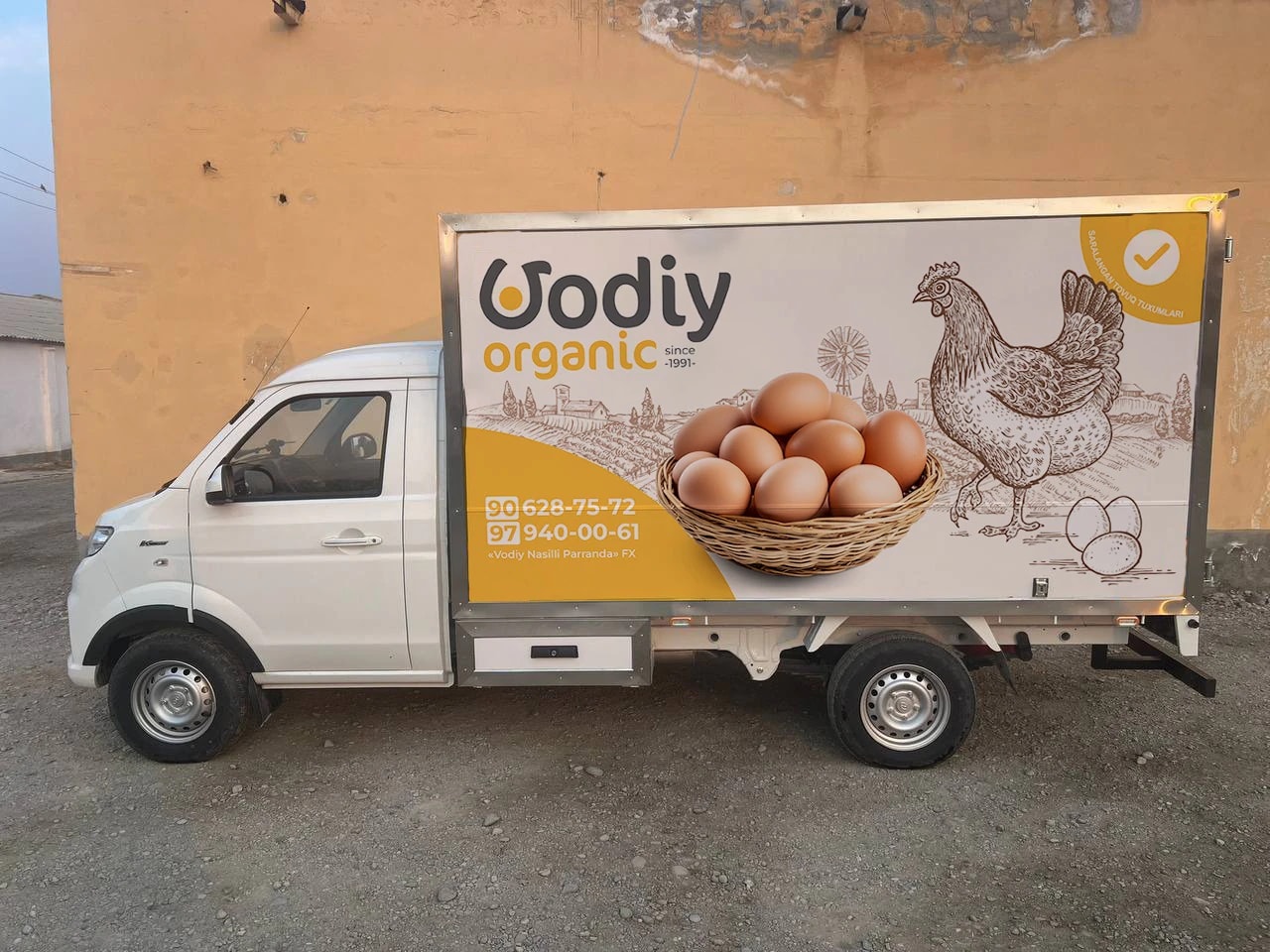
We slightly reworked the curve of the V and placed an egg in its open part. The result is a single, unified chicken shape. At the same time, a fried egg can be read inside the V. To enrich the packaging design, we added a chicken illustration and drawings that convey the atmosphere of a farm. The same style carries over to the delivery truck. The result is simple, clear and appealing egg packaging.

Next projects

Mega Food — logo for a food supply company
Schools, kindergartens and other institutions wait for fresh food every day — and Mega Food delivers it on time. For this company we created a logo that explains the business without a single word.

Sirius — logo for a medical center
Sirius is the brightest star we can see in the night sky. For centuries, many peoples have seen it as a symbol of goodness. For those who come seeking healing, Sirius medical center is meant to be a symbol of rescue — and that is where our logo began.